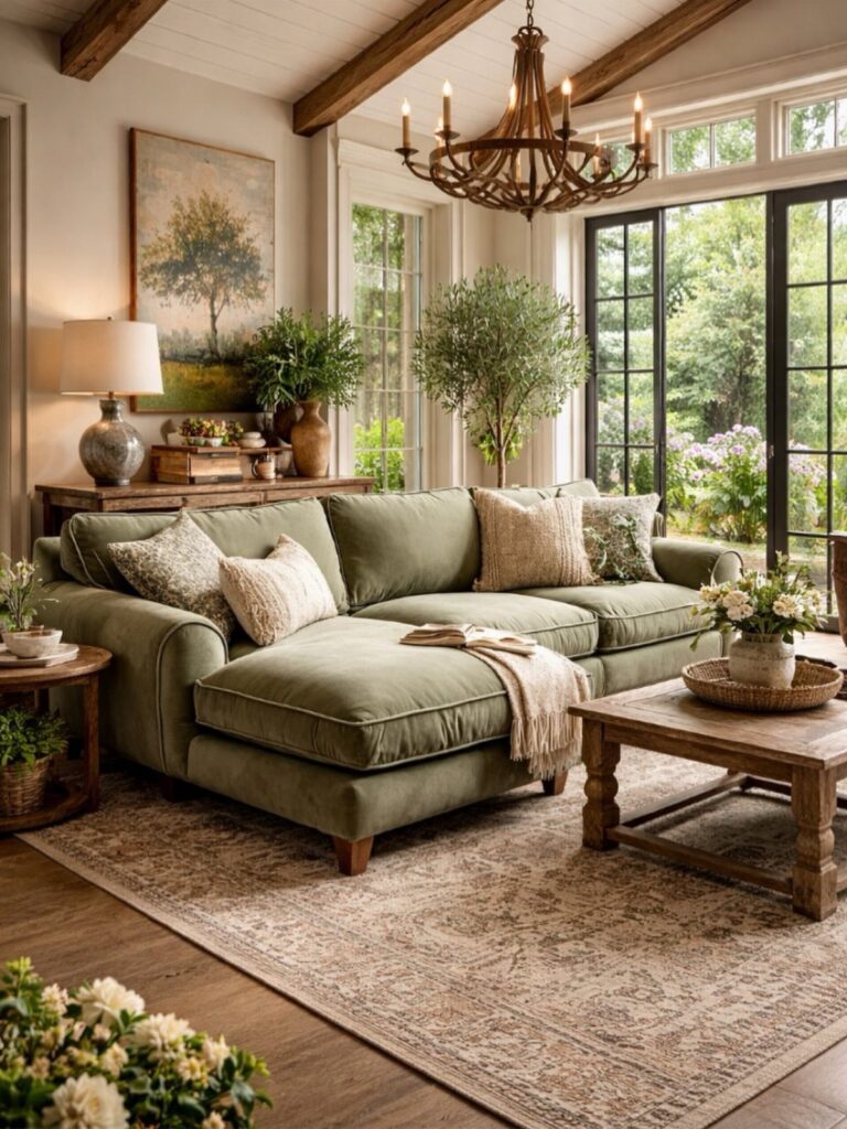
Farmhouse living rooms run from whitewashed shiplap with flea market signs to rough beams over linen furniture, and which direction works depends on whether the room already has enough texture or needs more contrast.
Natural fibers like jute and linen layer well within a neutral palette, while black distressed furniture shows wear without looking dirty.
A wood mantel grounds the fireplace without any symmetry, and a slipcover couch keeps the room relaxed enough that mismatched pillows still feel intentional.
1. Natural Textures
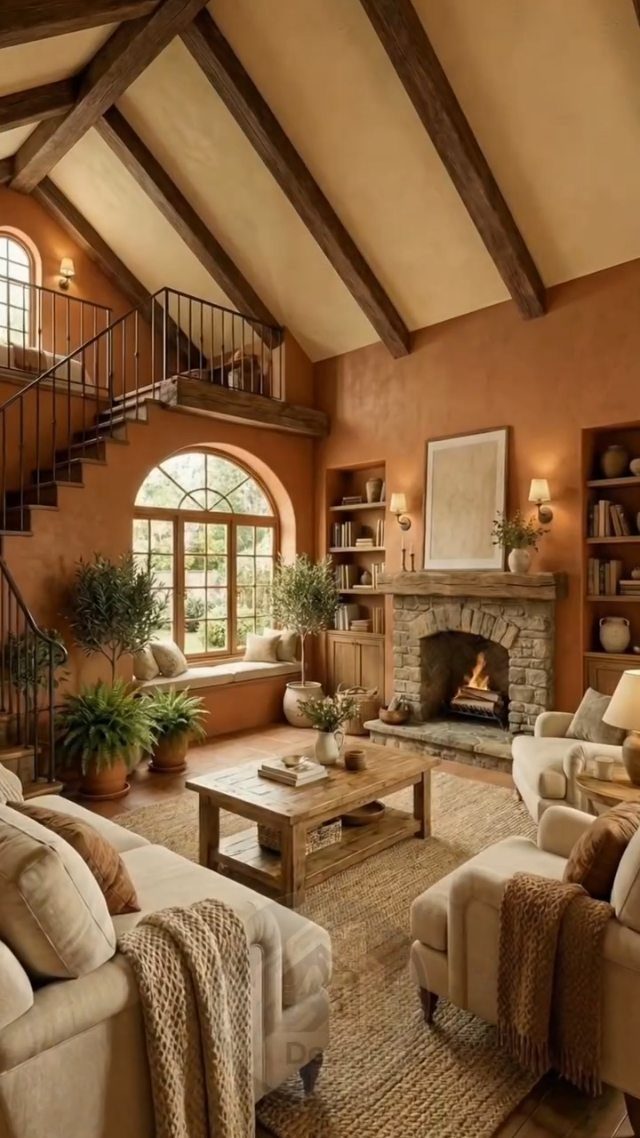
Natural textures bring warmth without extra color. Stone, wood and linen sit together because their surfaces vary more than their tones do.
I like mixing rough with smooth.
A wood beam next to a plaster wall, a jute rug under linen. The more uniform the palette, the more the materials can stand out on their own.
If the room feels flat, add one textured piece rather than another coat of paint.
A basket, a throw, a plant in terra cotta. Texture does what pattern usually tries to.
2. Distressed Furniture
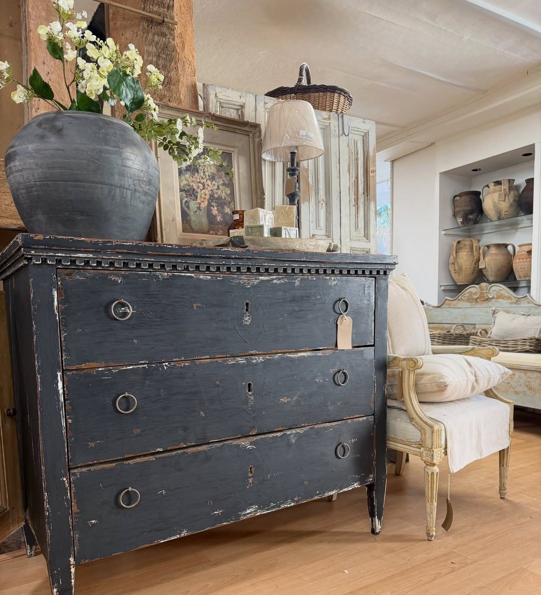
Distressed furniture adds age the room may not have earned. Chipped paint and worn edges read as collected over time, even when the piece is new.
Black works better than most people expect. It shows the wear without looking dirty, and it contrasts with the lighter walls farmhouse rooms tend toward.
Look for real wear if you can find it.
Furniture that has been painted and used and painted again has irregularities a sander can’t fake. If you’re buying new and distressing it yourself, focus on edges and corners where hands would have touched it.
3. Sliding Barn Doors
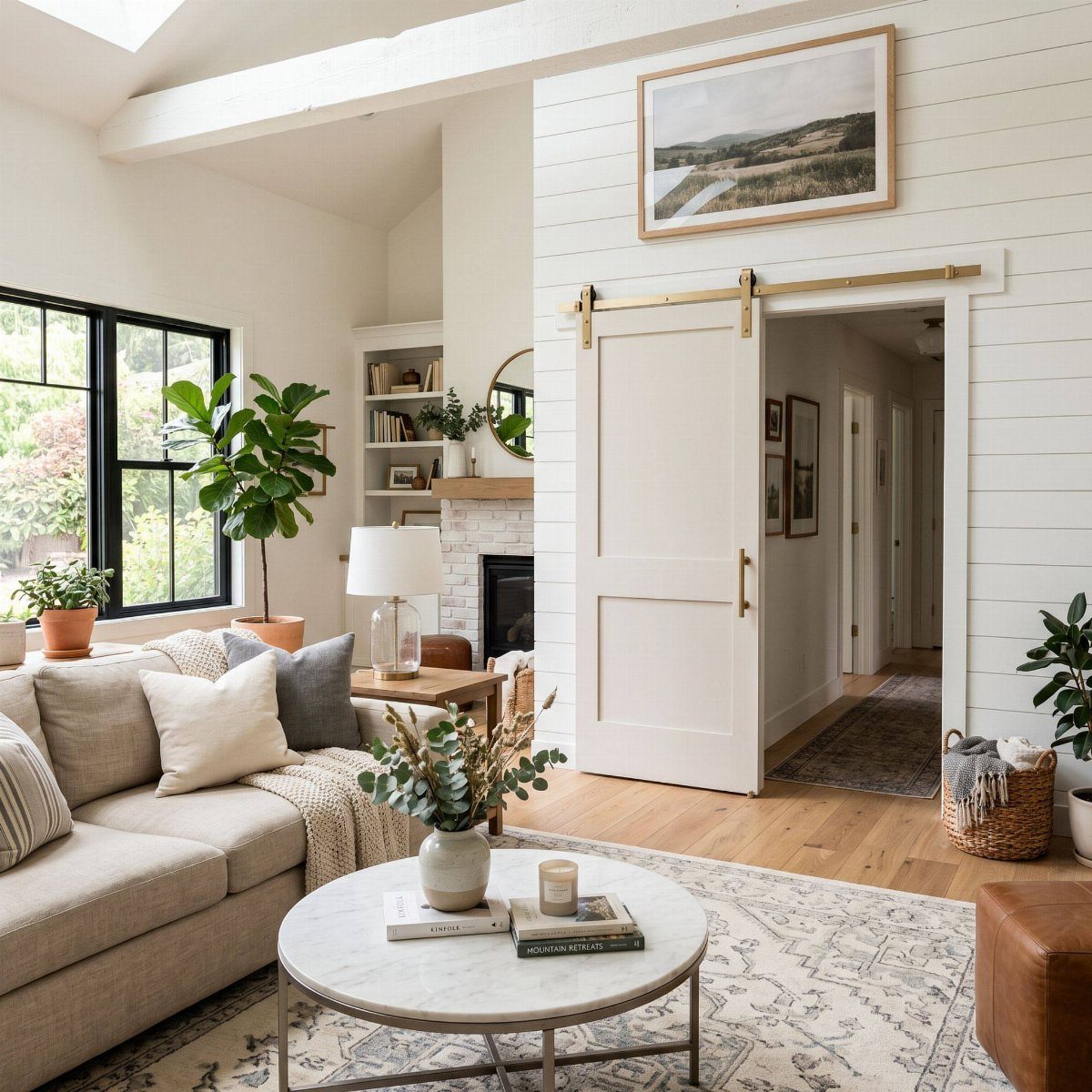
Sliding barn doors cover openings without taking floor space the way a swinging door does. They work between rooms or as closet fronts, and the hardware becomes part of the look.
White keeps the door from competing with what’s around it. The track can be black iron or brushed gold depending on what your other finishes are doing.
If the wall is narrow, the door can slide farther than the opening is wide, overlapping trim or furniture. Just measure past the frame so the track fits the opening.
4. Weathered Wood Walls
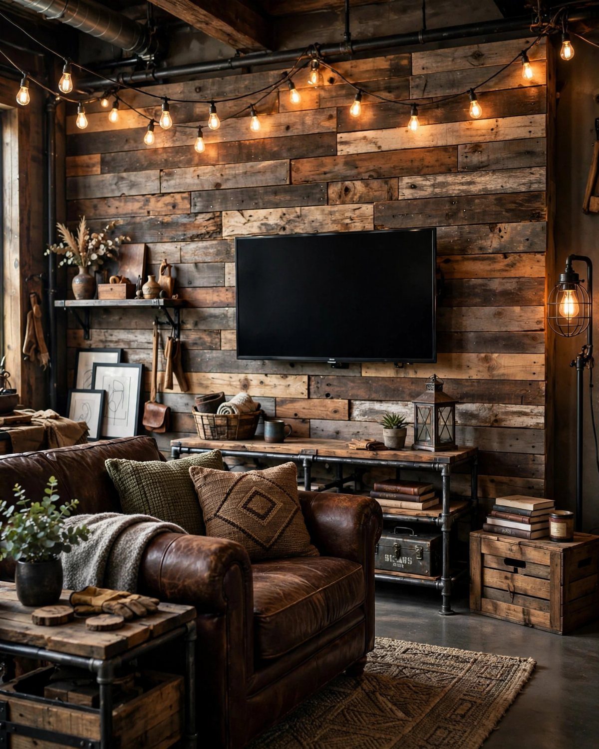
Weathered wood on one wall breaks up drywall without committing the whole room. The grain and the color variation between boards do more than paint can.
Reclaimed barn wood has the most character, but it also has the most prep.
New pine boards stained gray and wire-brushed get close for less time. Either way, the planks go up horizontally and you stagger the seams.
I’d keep it to one wall. More than that and the room starts to feel like a cabin instead of a house with farmhouse touches.
5. Rustic Mantels
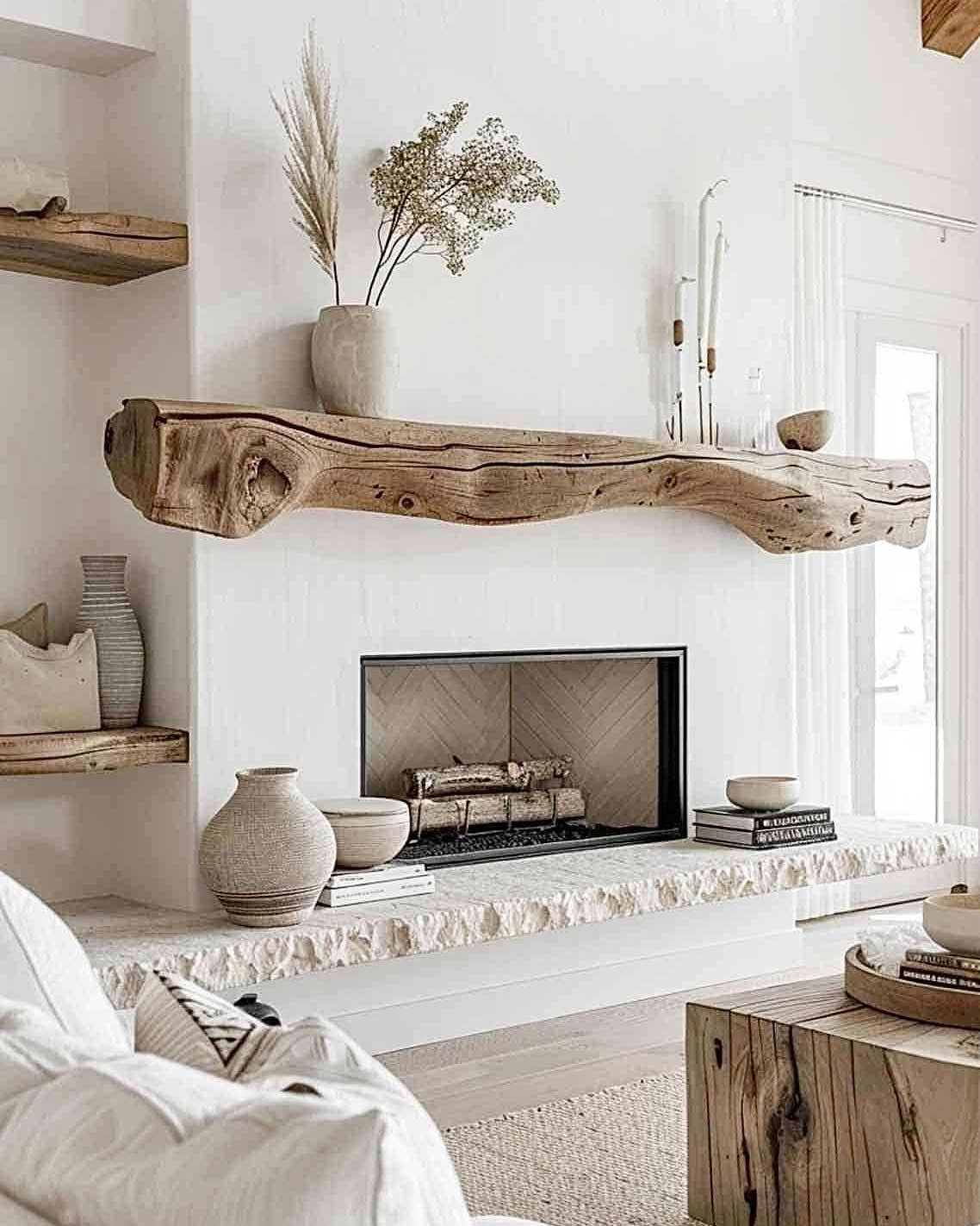
A thick wood mantel anchors the fireplace and gives you a shelf that looks intentional even when it’s holding just a few things. The grain and the rough edge matter more than symmetry does.
I prefer a beam with the live edge left on.
It doesn’t need to be perfectly square, and a little bark or sapwood keeps it from looking too finished. Mount it on hidden brackets so the hardware doesn’t show.
Scale it to the fireplace width. A mantel that’s too small looks like an afterthought, and one that overhangs too far reads as a different project.
6. Exposed Beams and a Bold Chandelier
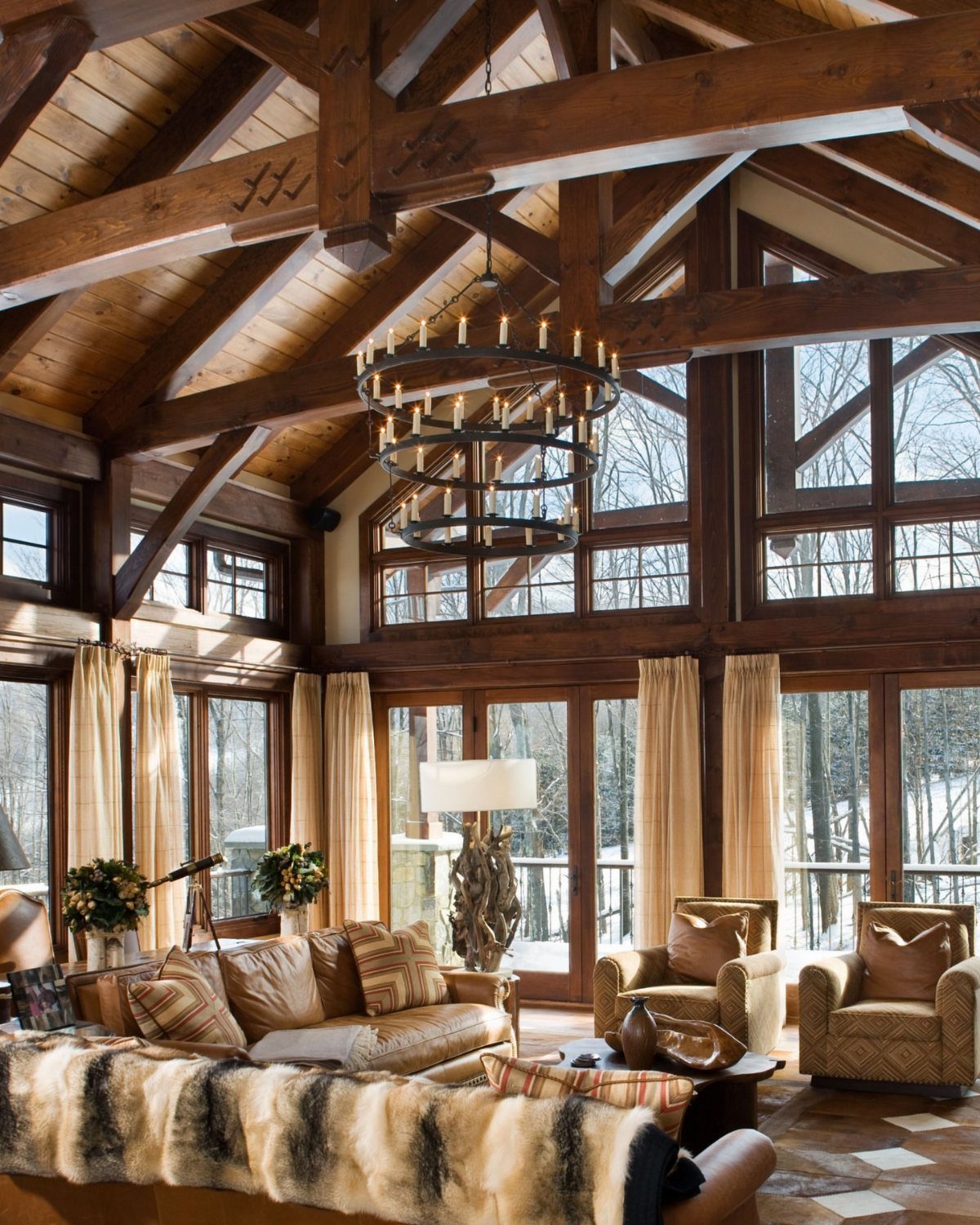
Exposed beams and a statement chandelier divide the ceiling into layers. The beams run the length of the room, the chandelier hangs between them, and the height becomes something the room uses instead of just has.
Dark wood beams contrast with white or light plaster.
If the ceiling is vaulted, the beams follow the slope and the chandelier drops from the peak. A tiered or circular fixture fills the space without blocking sightlines.
Match the chandelier scale to the room volume, not the floor area. A tall ceiling can take an oversized fixture where a standard room could not.
7. Neutral Shades
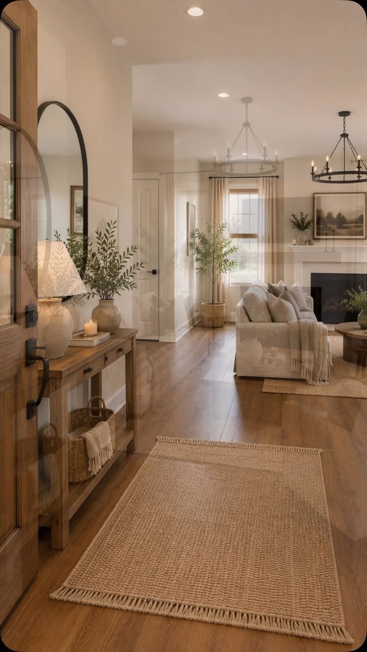
Beige, cream and soft gray hold a room together without drawing attention to any one surface.
The walls, the furniture and the floor stay within a few shades of each other, and the room feels larger because nothing breaks it into sections.
I keep the variety in the materials rather than the colors.
A linen pillow, a wood table, a wool rug. The texture does the work color usually would.
If it feels too quiet, add one warm tone. A caramel throw or a brass lamp brings in warmth without taking the room out of neutral.
8. Slipcover Couch
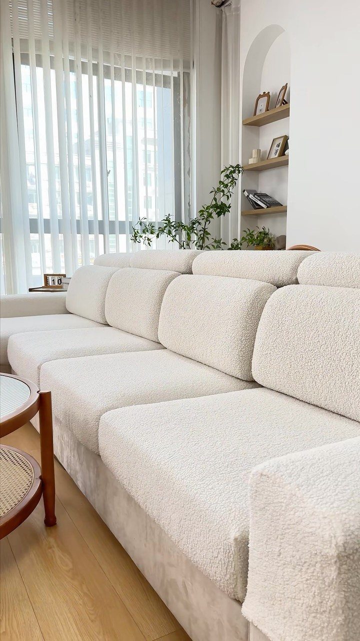
A slipcover lets you wash the couch instead of working around stains.
The fabric comes off, goes in the machine, and goes back on. It also hides a frame you don’t love or updates one you’re keeping.
White shows everything, but it also bleaches clean.
Oatmeal or natural linen hides more between washes. Either way, buy a slipcover cut for your frame or it will shift every time someone sits down.
Texture helps. A waffle weave or a loose linen looks softer than a tight twill, and it forgives wrinkles better too.
9. Farmhouse Decor Items
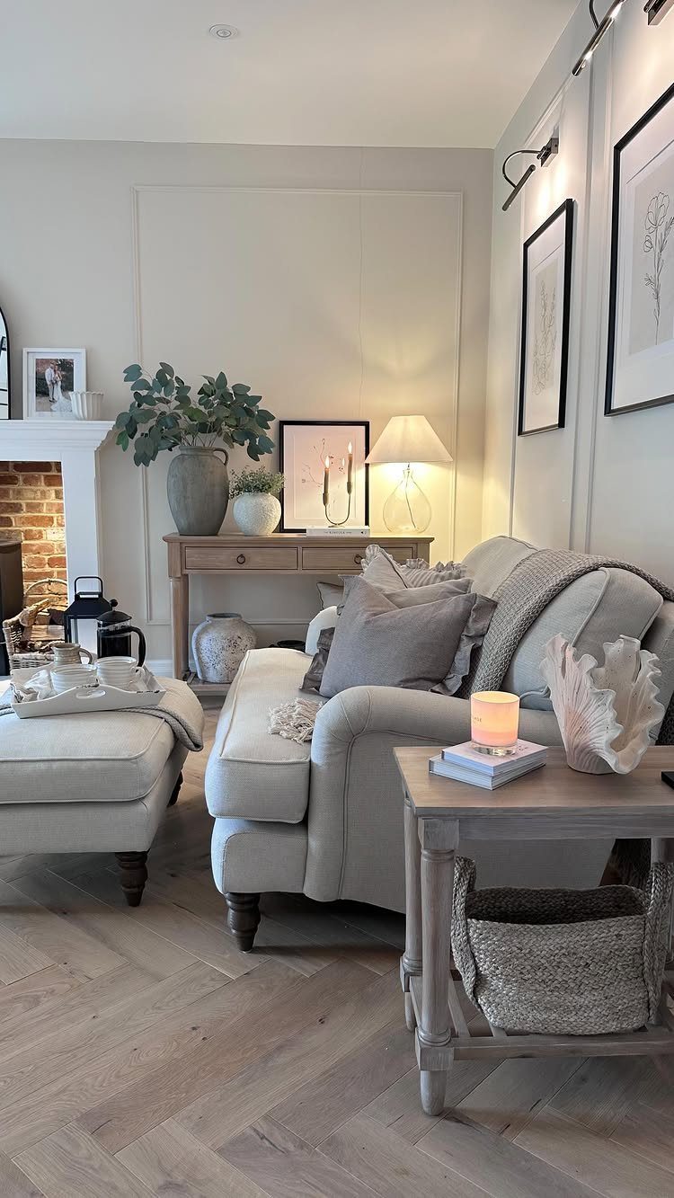
Pitchers, crocks and wooden boards feel like farmhouse pieces because they started as working tools. A dough bowl on the coffee table or a galvanized bucket holding firewood carries function even when it’s just holding space.
Keep the finishes varied.
Smooth ceramic next to rough wood, matte black iron next to whitewashed terra cotta. The shapes can be simple if the surfaces are not all the same.
I arrange things in threes or fives and give each grouping room to breathe.
3 candlesticks on a mantel with room between them read as intentional. Five in a row looks like inventory.
10. Layered Rugs
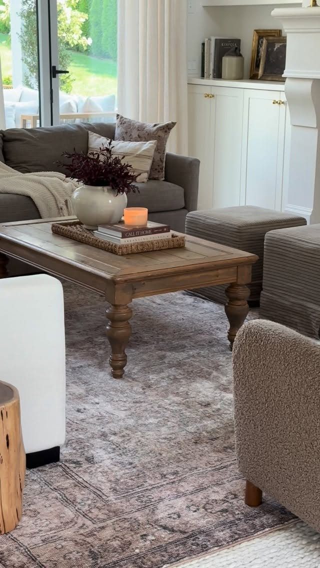
Layering rugs lets you add pattern without committing the whole floor. The smaller rug sits on top with pattern or color, while the larger one anchors the furniture and stretches past it.
Layering rugs adds depth, and the combination here keeps the pattern on top while the solid base anchors it. The top rug can be wool, cotton or a vintage piece with more color.
Anchor both under the front legs of the furniture so they don’t slide apart.
11. Open Shelving
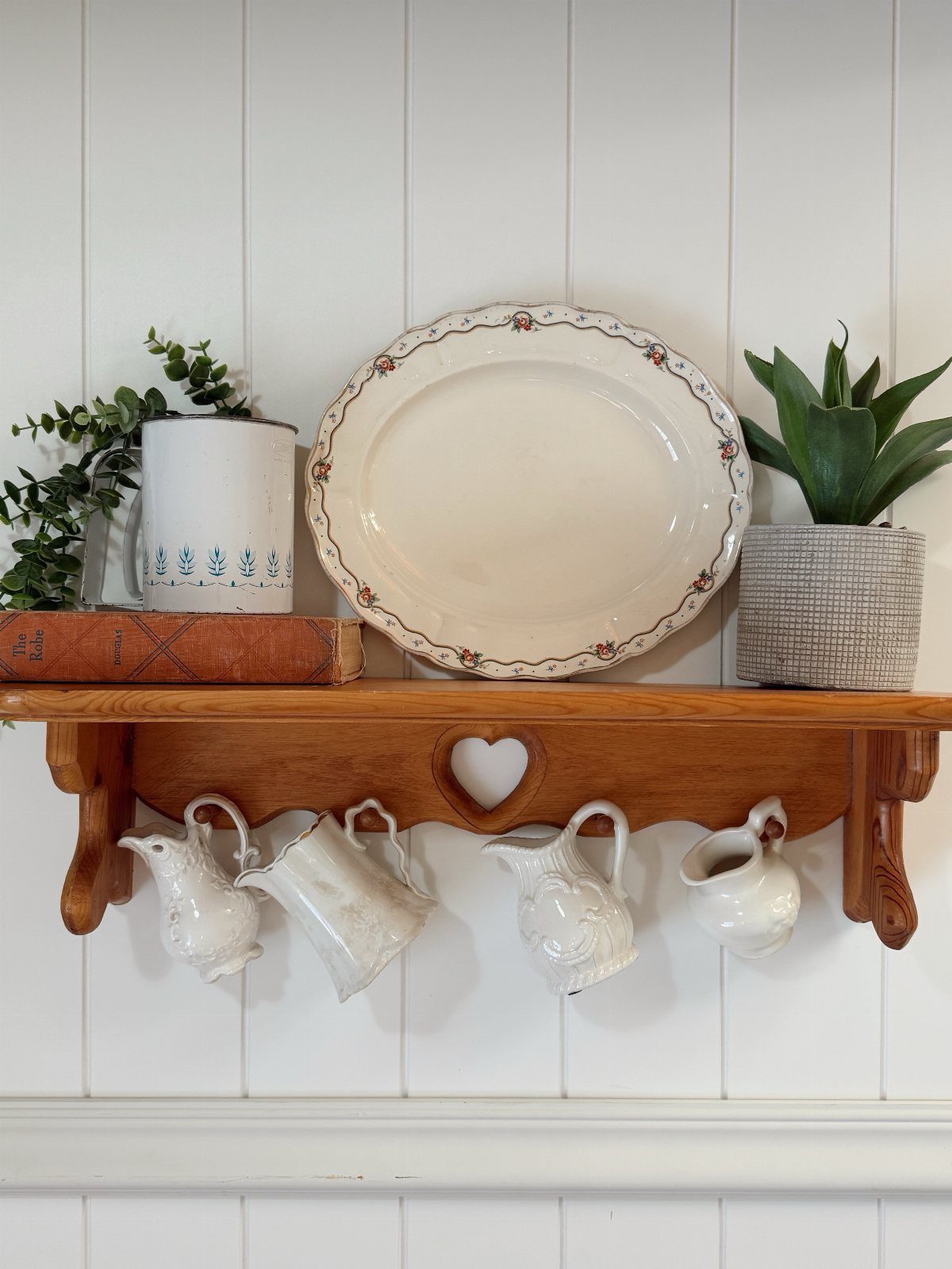
Open shelves put what you use within reach and turn everyday objects into the look of the room. Plates, bowls and mugs become the display instead of sitting behind cabinet doors.
I like wood shelves that feel decorative on their own. The shelf can be rough-cut or sanded smooth, and the brackets can be iron or steel depending on what the rest of the hardware is doing.
Keep the items grouped by type or color so it reads as organized rather than cluttered.
A row of white pitchers or a stack of wooden cutting boards makes more sense to the eye than random objects scattered across the span.
12. Gallery Walls
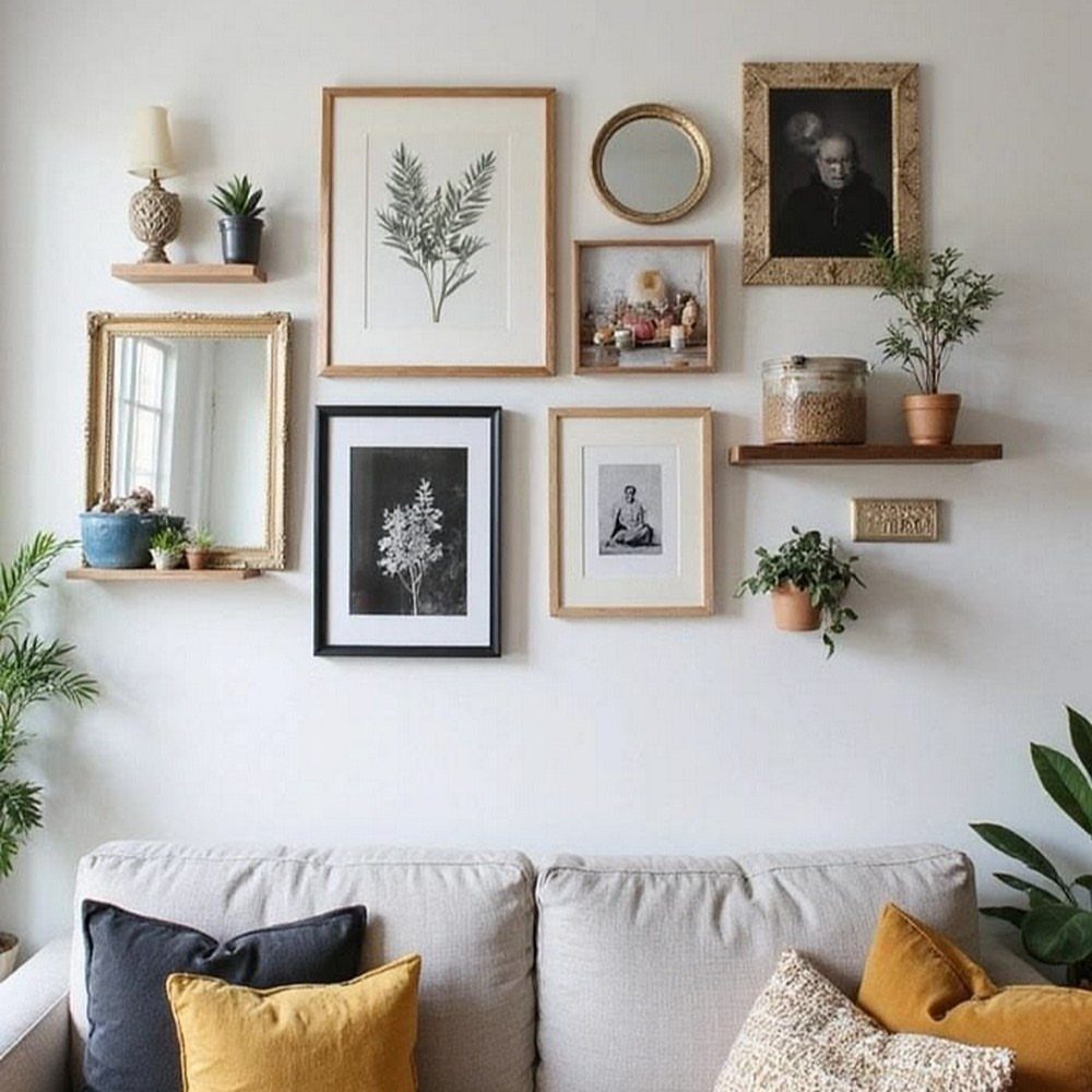
A gallery wall fills vertical space with pieces that matter to you. Frames in different sizes and finishes sit together because the spacing between them stays consistent.
I start with the largest frame at eye level and build out from there. Throw in a mirror or a narrow shelf next to the frames if the wall starts feeling flat.
Black, wood and white frames work together without looking too matched. Hang everything before you commit to nails: tape paper templates to the wall first and adjust until the layout feels balanced.
13. Accent Pillows
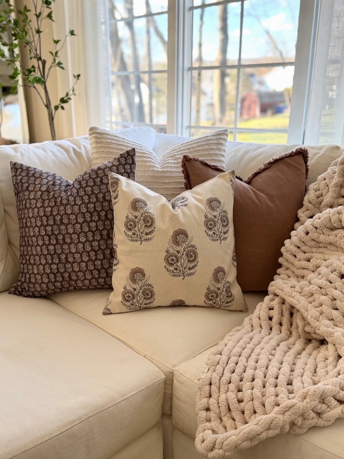
Pillows in neutral tones with one or two textured pieces soften a solid couch without adding pattern the room doesn’t need. Linen, cotton and chunky knit work together because the surfaces change even when the colors don’t.
I group pillows by texture rather than by matching sets.
A waffle weave next to a cable knit, a smooth linen behind both. If the couch is light, a few darker pillows in taupe or caramel keep it from washing out.
Two or three per seat is enough. More than that and you’re moving them every time you sit down.
14. Natural Fiber Curtains
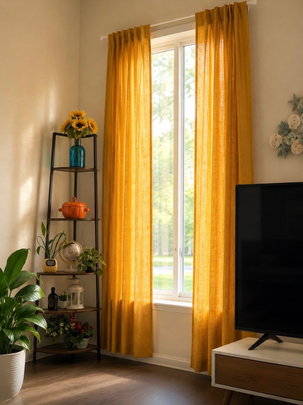
Linen or cotton curtains filter light without blocking it completely. The weave shows through when the sun hits, and the fabric moves when the window’s open.
Floor-length panels make the window feel taller than it is. Hang the rod a few inches above the frame, with fabric that skims the floor or puddles slightly if the room can handle the extra length.
Color can go warmer than the walls. A soft gold or ochre brings in tone without reading as heavy, and it picks up natural light better than white does.
15. Built-in Benches
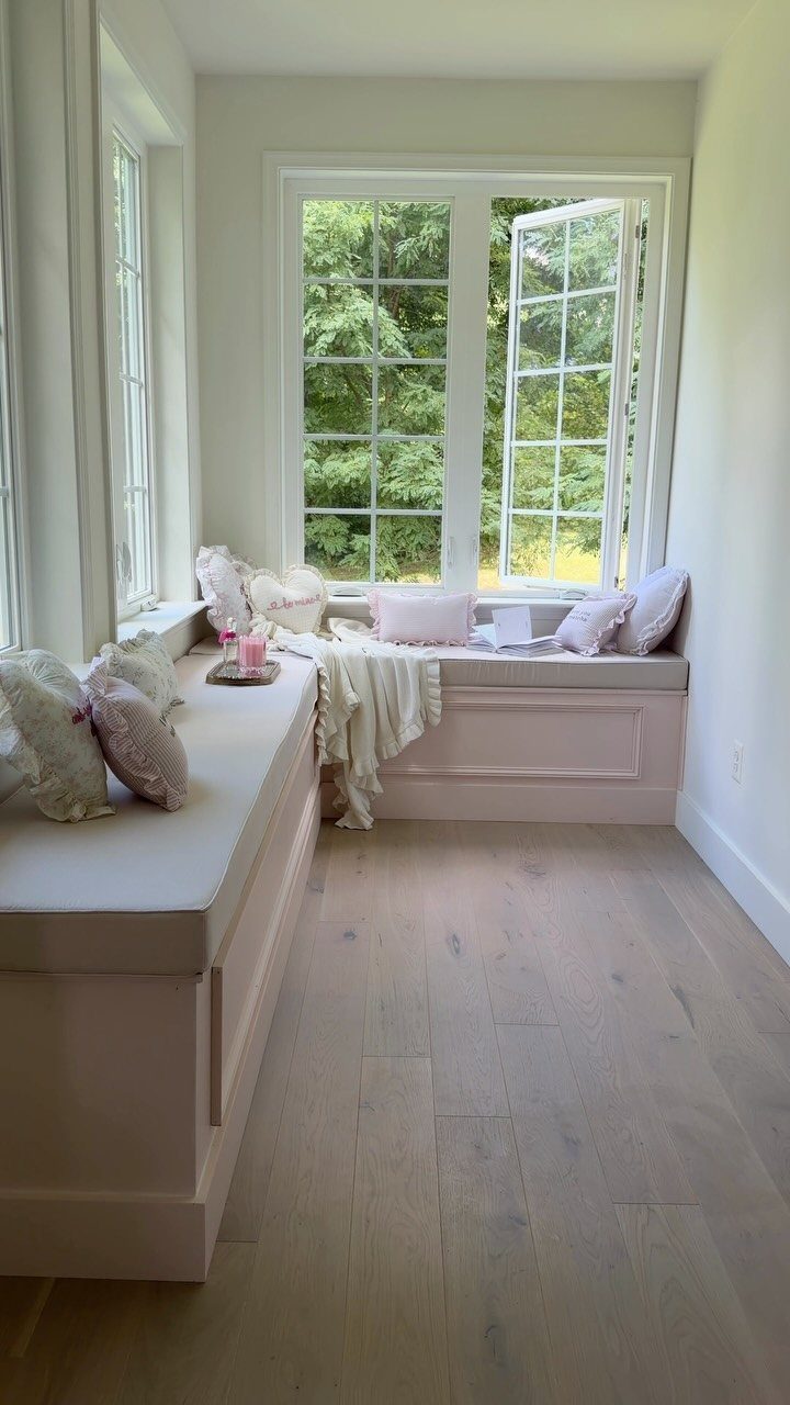
A built-in bench turns dead space under a window into seating that doesn’t take floor area. The frame sits between walls or runs along one side, and a cushion on top makes it usable.
This one includes storage underneath, which makes the most of the footprint.
Hinged lids or pullout drawers keep blankets or books out of sight. The cushion can be foam wrapped in canvas or a single piece cut to fit the span.
Pillows make it comfortable enough to sit for more than a few minutes. Without them it reads more as a ledge than a seat.
16. Woven Baskets
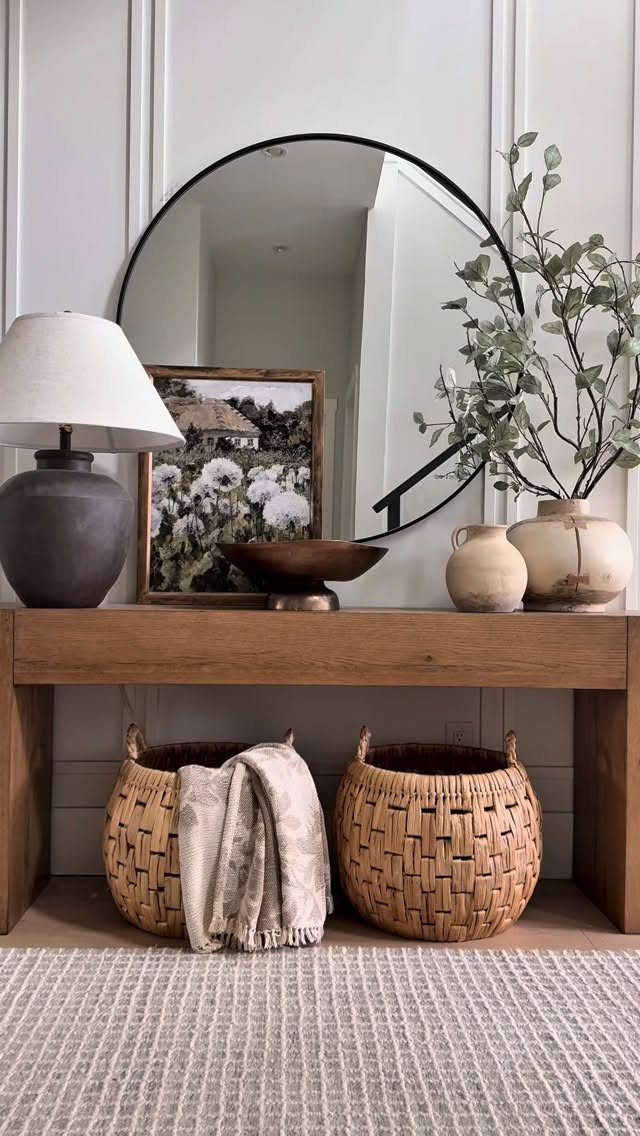
Woven baskets hold what you don’t want on display and look like part of the room while they do it. They slide under tables, sit next to furniture, or stack in a corner when you need more than one.
Natural fiber in seagrass or rattan works with wood furniture without competing. The weave gives texture, and the neutral tone keeps it from standing out too much.
Size them to what they’re holding. A basket that’s too small looks full all the time, and one that’s too large sits half empty and takes up more space than it’s worth.
Choosing the Right Color Palette
Soft whites and creams open up the room without demanding attention. I use warm neutrals like beige or ivory on walls and large upholstery pieces where the color needs to recede.
Depth comes from earthy accent tones.
Terracotta, olive green or faded navy work on pillows or artwork when the rest of the room stays light. These colors sit comfortably in a farmhouse palette because they’re muted rather than bright.
Small amounts of black add contrast without weight.
Window frames, light fixtures or metal decor in black sharpen the edges of a soft room. The key is keeping it to details rather than large surfaces so it punctuates instead of dominates.
Rich brown on a sofa against light walls brings warmth in a way beige furniture cannot. Rust-colored accents next to that brown deepen the palette while the walls stay neutral.
Creating a Cozy Atmosphere
Ceiling beams, coffee tables or shiplap walls add texture the room reads as farmhouse without needing much else.
Textile variety creates tactile richness.
I layer linen curtains with cotton throws and wool rugs, all in the same neutral range but with different textures. The more textures you include, the less the room needs from color.
Baskets do the same and add function at the same time.
Warm accent colors soften an otherwise neutral room. Reds and oranges in textiles blend with the natural tones in wood and make the space feel more lived in.
Powder blue furniture with gray accents against white walls opens up the room while keeping farmhouse touches intact through dark metal fixtures.
Mixing Styles
Farmhouse style mixes well with other approaches because it starts with neutral tones and natural materials rather than a fixed set of rules. That gives you room to bring in vintage finds or modern pieces without losing the base.
I go for comfort with a little character. Natural textures, neutral colors and collected objects build a space that feels personal rather than styled from a catalog.
Accents let you adjust the look toward what you prefer.
Frequently Asked Questions
What are the different types of farmhouse styles?
Modern farmhouse, traditional farmhouse, and cottage farmhouse are the main variations.
Modern farmhouse mixes rustic elements like weathered wood and natural textures with sleeker lines and contemporary finishes. Traditional farmhouse leans into antique pieces, distressed furniture, and collected objects that feel worn in over time.
What colors are suitable for a farmhouse living room?
Soft whites, creams, beiges and grays work as the foundation, keeping walls and large furniture light. Throw pillows in rust, sage, or dusty blue keep the warmth grounded and give the room a layer it can lean into.
A black sconce or a pair of iron curtain rods gives the palette an edge and holds the soft neutrals in place.
What is replacing modern farmhouse style?
Farmhouse style is shifting toward more personalized and eclectic spaces rather than catalog looks.
The base of neutral tones and natural materials stays, but people are mixing in vintage finds, modern pieces, and collected objects that reflect their own taste. Comfort and character matter more than following a fixed set of rules.