Options run from floor-length panels and roman shades to velvet drapes and two-tone designs, and layering techniques stretch the range even further once you start combining sheers with blackouts or adding tiebacks.
The decision hinges on whether you want light control, privacy, or just a softening frame, and whether the panels will stay put or slide open and closed every day.
1. Floor-to-Ceiling Curtains
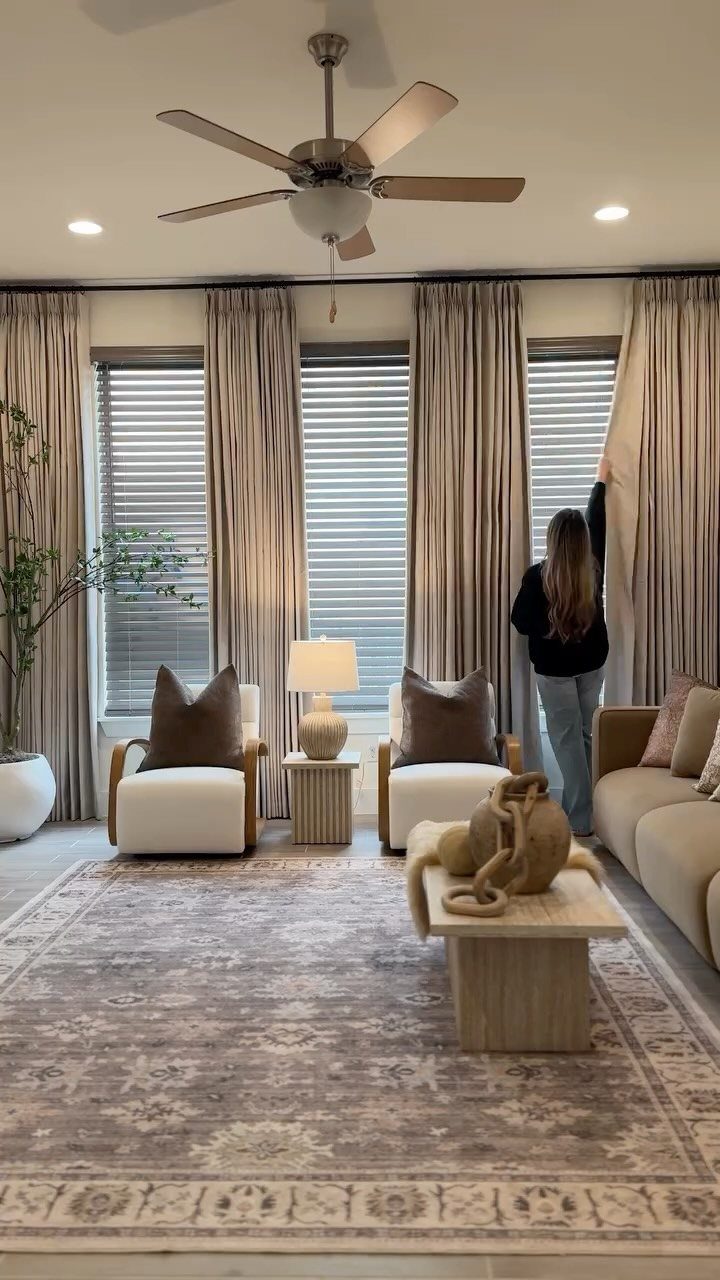
Hanging curtains all the way from the ceiling down to the floor makes any room feel taller than it is. The fabric stretches the wall vertically, and your eye follows that line up instead of stopping at the window frame.
Install the rod a few inches below the ceiling or mount it directly to the ceiling if the hardware allows it. The hem should rest on the floor or pool slightly, not stop short.
This works in any living room, but makes the biggest difference when you want more height.
2. Roman Shades
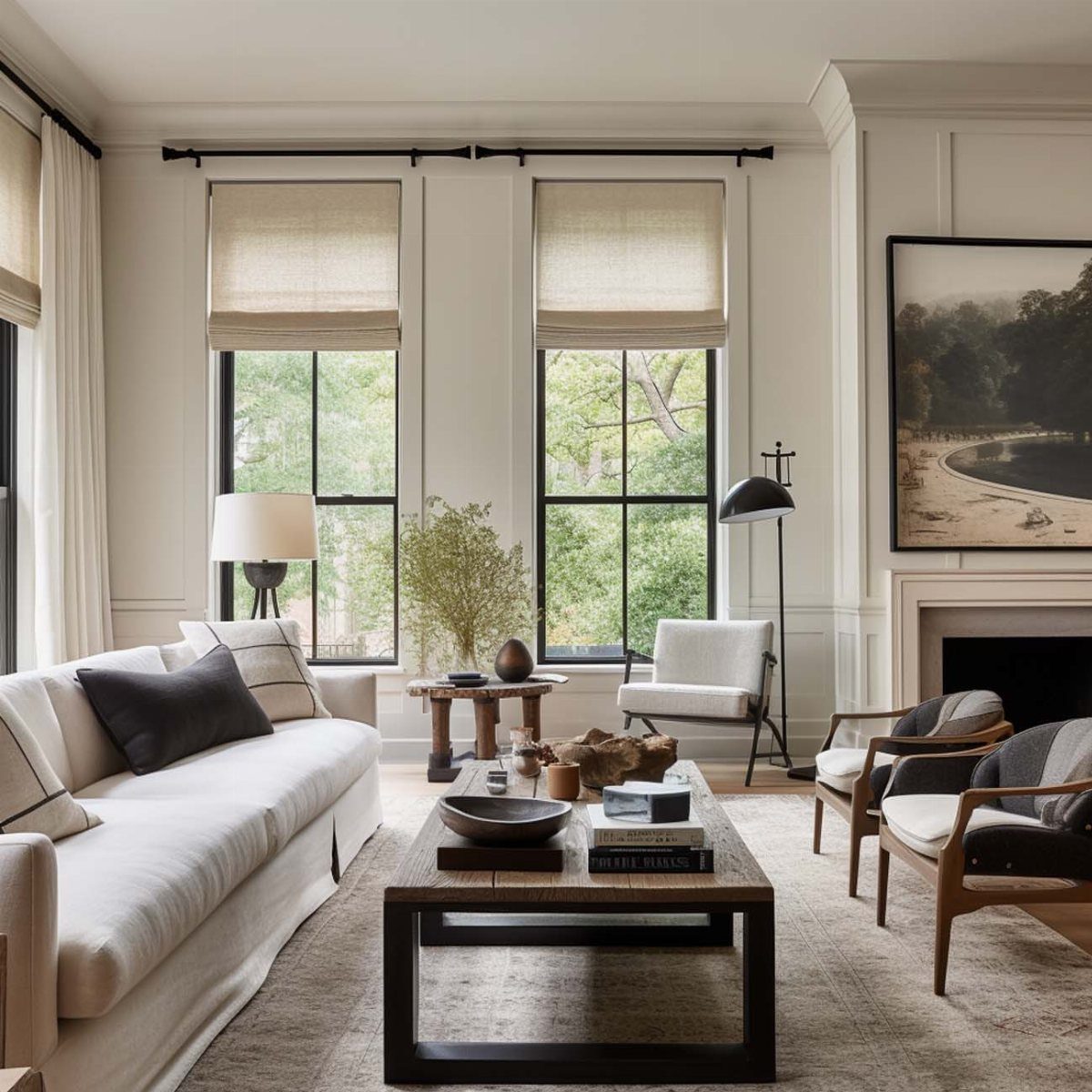
Roman shades fold up in clean horizontal pleats when you raise them, so they take up almost no visual space compared to curtains bunched at the sides.
The flat fabric sits close to the window and keeps the wall around it open.
They work well in living rooms where you want coverage without the bulk, especially if you have furniture placed near the windows or if the room is small enough that long curtains would overpower it.
You can mount them inside the window frame for a tailored look or outside to cover more wall and block light around the edges.
3. Bold Patterned Curtains
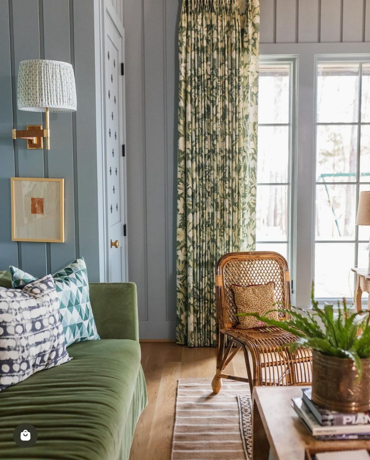
A bold pattern on the curtains pulls attention to the windows and anchors the room around them. The pattern becomes the first thing you see when you walk in, so it sets the tone for everything else.
Repeating the pattern in throw pillows or a rug keeps the bold curtain design connected to the room instead of floating on its own.
If the rest of the room is neutral, the curtains can carry almost any pattern you like. If you already have patterned furniture or rugs, keep the curtain pattern simpler or use the same print family.
4. Velvet Curtains
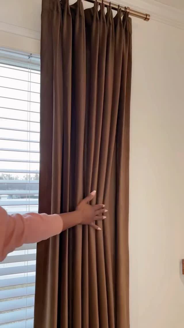
Velvet has weight and texture that lighter fabrics do not, and it absorbs light instead of reflecting it, so the color reads deeper and more saturated on the wall. The fabric hangs in heavy, straight folds that stay in place.
It blocks more light and sound than linen or cotton because of how dense the pile is, which makes it a good choice for living rooms that face the street or get strong afternoon sun.
Velvet shows marks if you handle it too much, so hang it and leave it. Dry cleaning is the safest way to clean it, though some synthetic velvets can be machine washed on gentle.
5. Smart Motorized Curtains
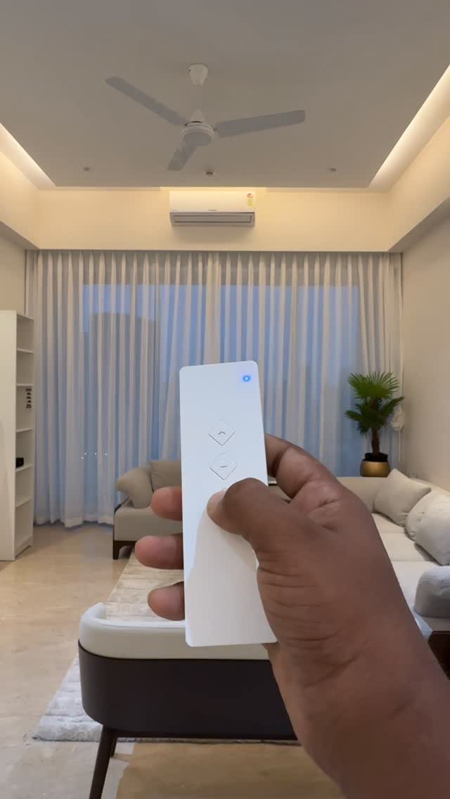
Motorized curtains open and close with a remote, a wall switch, or a voice command through a smart home system.
You do not have to walk over and pull them by hand, which matters most for windows that are hard to reach or curtains that are heavy.
The motor sits inside the rod or attaches to it, and the curtains glide along a track. Installation is straightforward if you are replacing an existing rod, though you will need an outlet nearby or battery power for the motor.
This setup works well if you want to automate your light control or if you have tall windows where pulling the curtains manually is awkward.
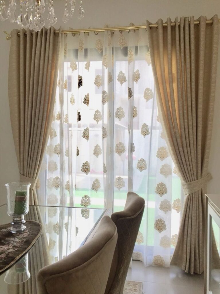
6. Layered Sheer and Blackout Curtains
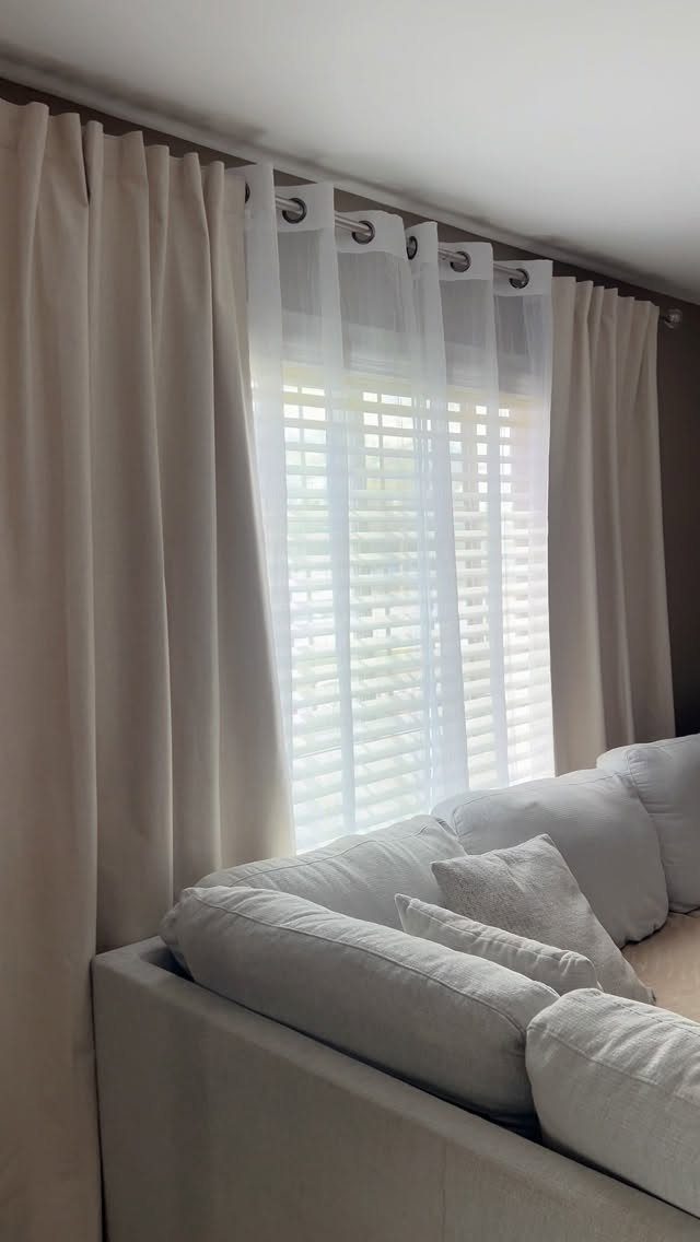
Layering sheer curtains with blackout panels on the same rod gives you 2 levels of light control.
During the day, close the sheers for privacy while still letting soft light through. At night, pull the blackout layer to block everything.
Mount both on a double rod or use back-tab sheers behind front-rod blackout panels so you can slide each layer independently. The sheers hang closer to the window, and the heavier blackout panels go in front.
7. Tangerine Orange Curtains
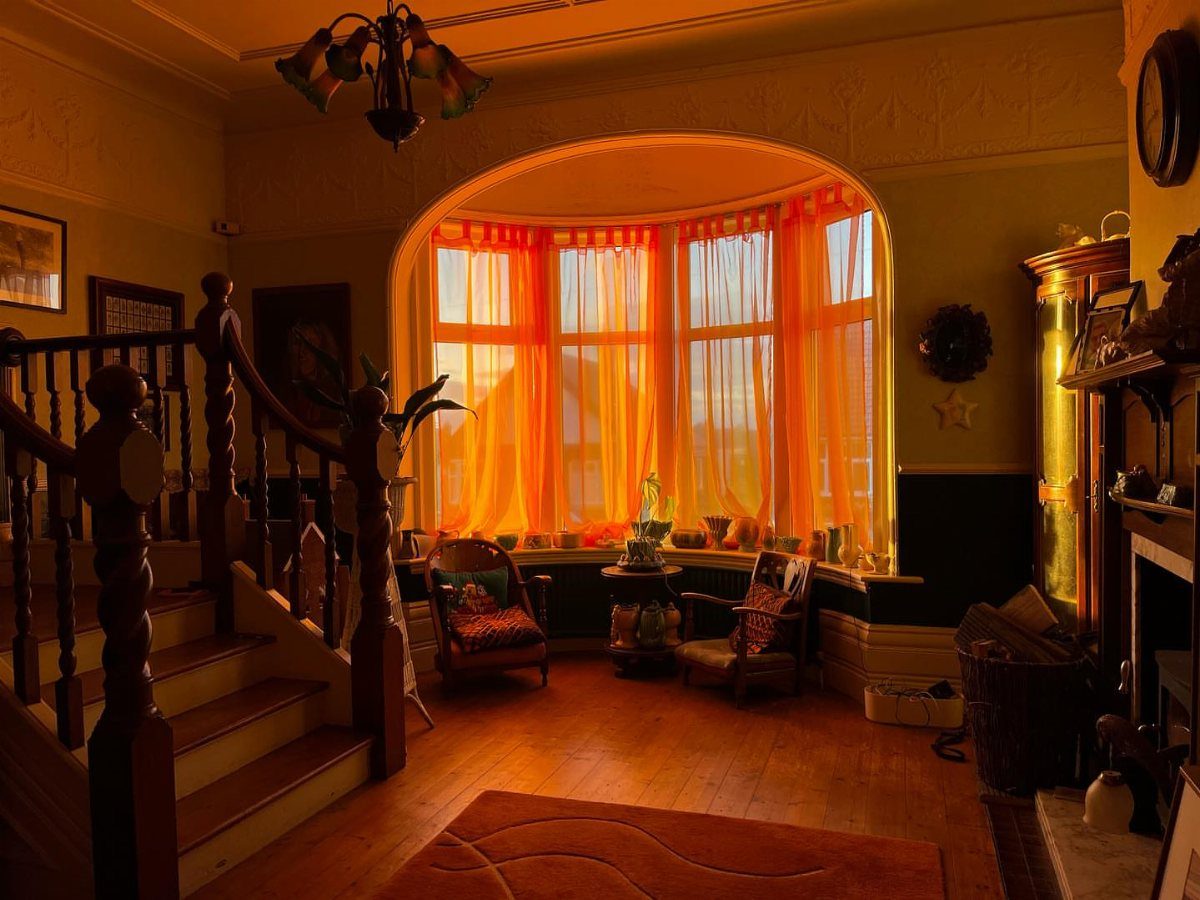
The tangerine pulls together the wood floor, the stair rail, and the warm undertones in the upholstery without matching any of them exactly. The curtains read bold from across the room but tied in once you notice those echoes.
Orange sits between red and yellow on the wheel, so it works with both warm neutrals and cooler grays. If your living room already has wood trim or leather furniture, a burnt orange or rust tone connects to those materials.
A bright tangerine like this one needs at least one other warm element in the room to keep it from feeling random.
8. Neutral Living Room Curtains
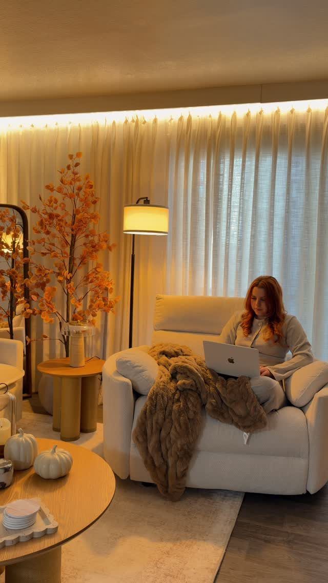
Neutral curtains in beige, cream, or soft gray let the furniture and art carry the color while the windows stay quiet.
The fabric filters light without drawing attention to itself, so the room feels open and the focus stays on what you put in it.
This works in any living room, but especially when you want flexibility. Neutrals do not lock you into one palette, so you can change pillows, rugs, or wall color without replacing the curtains.
Linen and cotton in light colors soften the light that comes through without blocking it completely.
9. Two-Tone Curtains
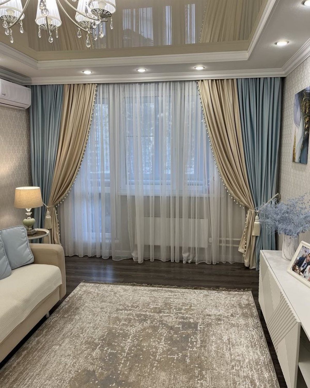
Two-tone curtains split the panel horizontally, usually with a lighter color on top and a darker one below or the reverse.
The division creates a clear visual break that pulls the eye across the window instead of just up and down.
The line where the 2 colors meet can sit at any height, but putting it around a third of the way from the top or bottom keeps the proportions balanced.
Match one of the colors to something already in the room so the curtains feel connected rather than added on afterward.
10. Curtain Tiebacks
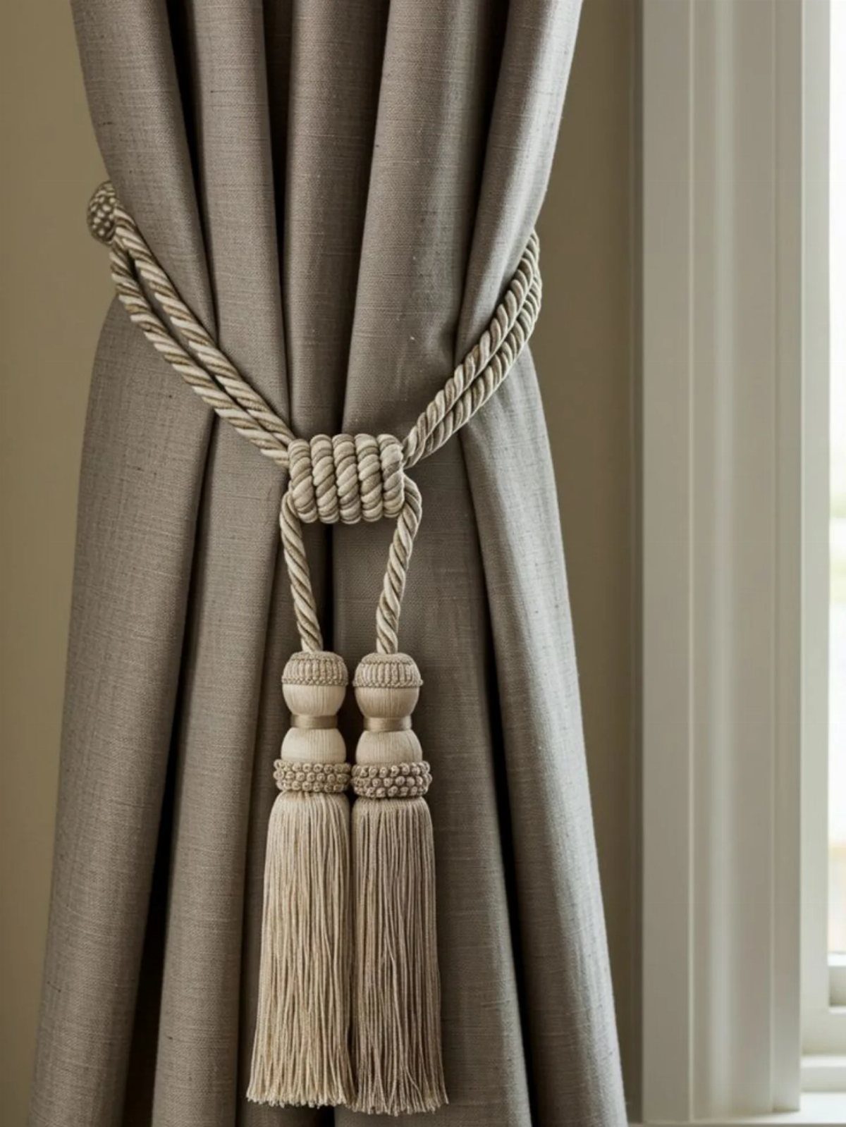
Tiebacks hold the curtains open to the sides and let more light in during the day. The fabric gathers in soft folds instead of hanging flat, which adds shape to the window even when the curtains are not closed.
Rope tiebacks with tassels bring in weight and a bit of coastal or formal detail, depending on the finish. Metal holdbacks work better in modern spaces, and fabric bands keep the look clean if you want something simple.
Mount the hardware about two-thirds down the panel, which lets the fabric bunch above the tie and still drape below.
11. Airy Scandinavian
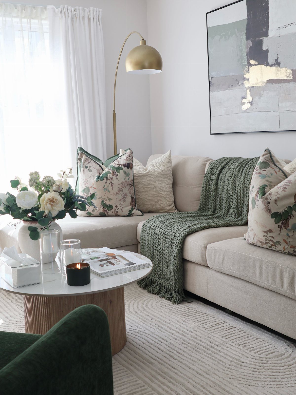
White or off-white sheers filter daylight without blocking it, which keeps a living room bright and open the way Scandinavian interiors do.
The fabric softens the light that comes through the window but does not darken the room or add visual weight to the walls.
Hang them on a simple rod with minimal hardware so the curtains stay understated. If you need more privacy at night, add a roller shade behind the sheers that you can pull down after dark.
This approach works best in rooms where you want as much natural light as possible during the day.
12. Pooling Curtains
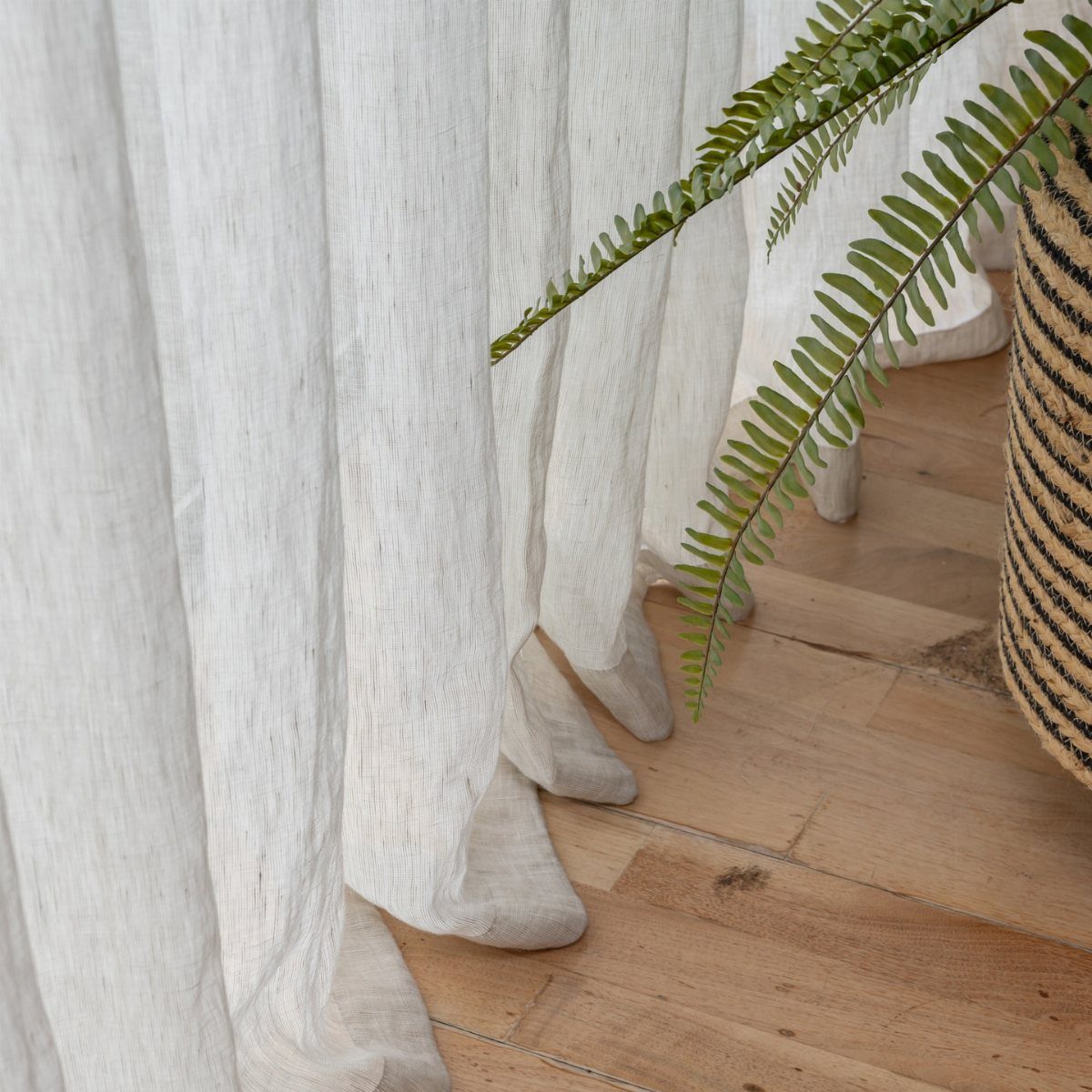
Pooling curtains are cut longer than the floor-to-ceiling measurement so the extra fabric spreads out on the floor in soft folds.
The effect is more relaxed and formal at the same time, and it works when you want the curtains to feel luxurious rather than tailored.
Add 2 to 6 inches past floor length when you measure, depending on how much fabric you want pooling at the baseboard. More than that and the fabric bunches instead of draping.
This only works if you do not open and close the curtains often, since dragging them across the floor wears the fabric and picks up dust.
Choosing the Right Curtains
Start with the room you already have. If the room already has bold pieces, keep the curtains quieter or pull from a color that is already there.
If you open and close the curtains every day, choose a weight and hardware that slide easily. If they stay in place most of the time, you can go heavier or more decorative.
Measure the width of the window and add enough fabric so the curtains look full when closed, not stretched flat.
Measure the length from where you plan to mount the rod down to the floor, then decide whether you want them to just reach or pool slightly.
If you’re sitting in your living room sensing something isn’t right—maybe there’s not enough color, personality, privacy, or coziness—the problem might be your living room curtains.
Curtain Placement Tips
Hanging the rod 2 to 6 inches above the window frame pulls the eye up and makes the wall feel taller.
If you want the window itself to be the focus rather than the curtains, mount the rod right at the top of the window trim.
The eye moves straight to the glass and the view outside, and details like hardware or pleats sit closer to where you are already looking.
The rod should sit 3 to 6 inches past the frame on each side so the panels stack off the glass when you pull them open. That keeps the fabric from blocking light during the day.
Layering Techniques
The 2 fabrics do not need to match exactly, but they should share a tone or sit in the same color family so they read as one window treatment instead of 2 separate pieces.