When color shows up in more than one place, in different forms, the room starts to feel planned instead of accidental.
Colorful room ideas range from temporary light effects you can set up in an afternoon to painted surfaces and built-ins that become part of the room.
Some of these work for renters who need to reverse them later, and some are permanent changes that make sense if you own the place.
1. Painted Ceiling
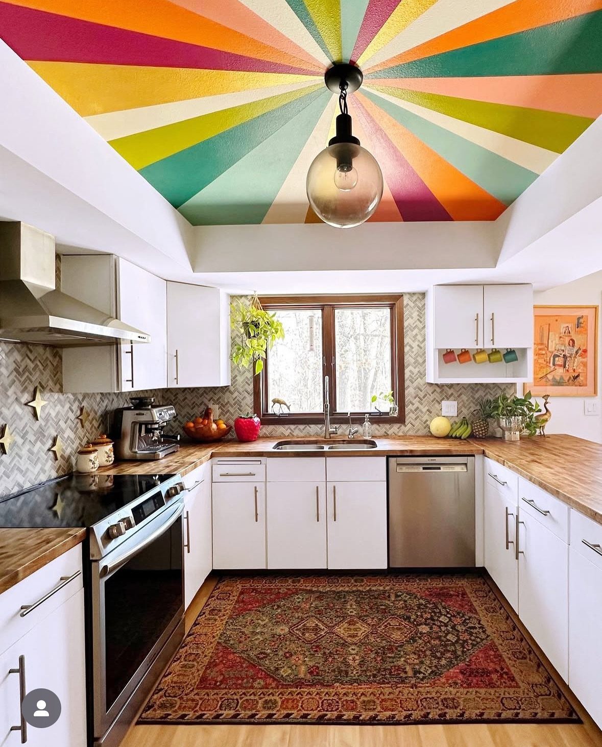
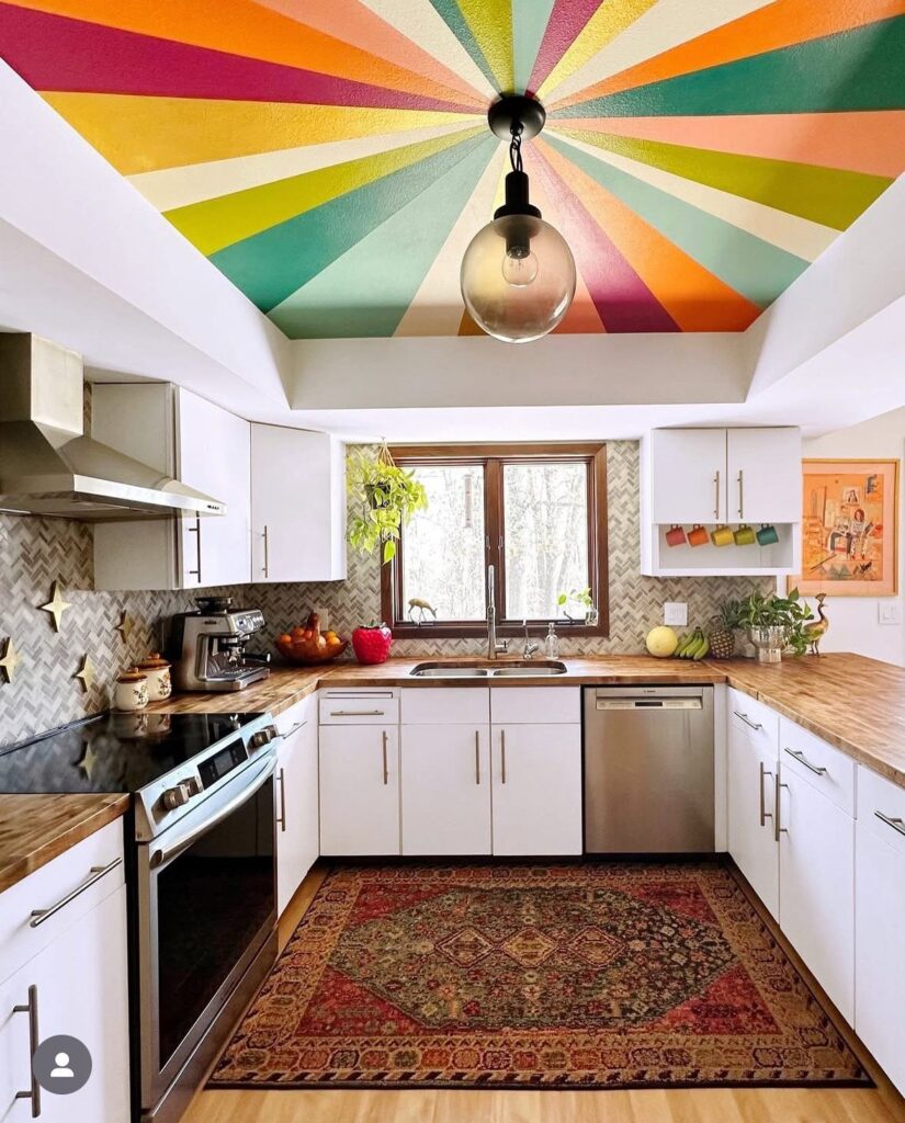
A painted ceiling pulls color overhead where most rooms leave it neutral. That changes the feel of the whole space without touching a wall or moving a single piece of furniture.
The radiating pattern stays grounded because the colors come from the same family and the white cabinets below stop the room from feeling closed in.
In a smaller kitchen, choose a handful of colors instead of a full spectrum and keep the rest of the room light.
Ceiling paint goes on slower than walls because of the angle, so budget an extra hour per coat.
2. Colorful Furniture
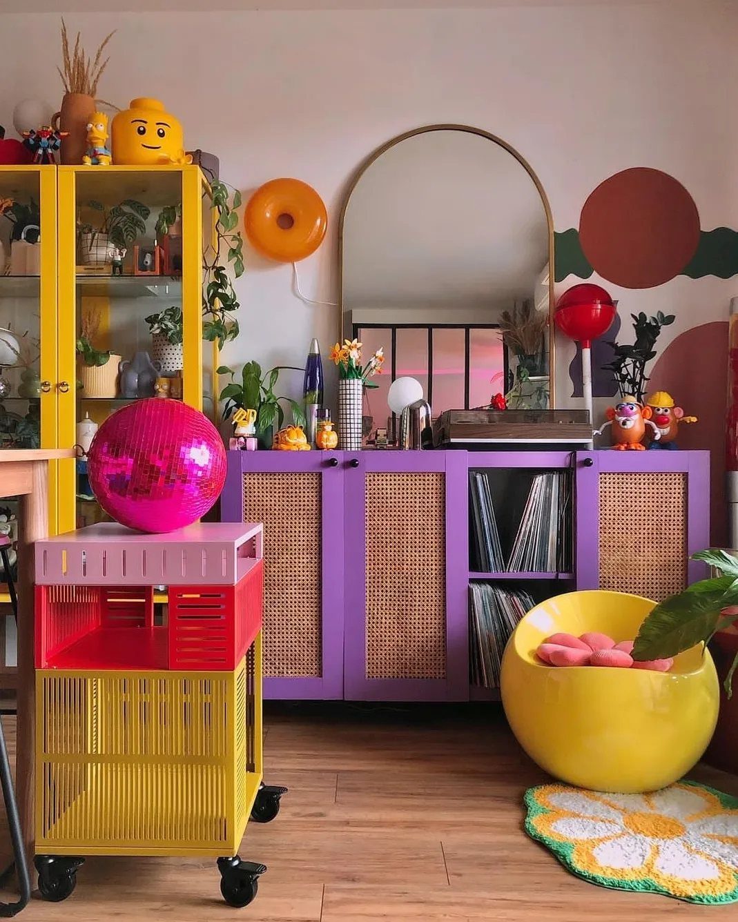
Furniture in saturated color does more than an accent wall because it carries weight in the room. A single bold piece reads as intentional; several in different hues turn the whole space playful.
Mixing yellow and purple like this works because they sit opposite each other on the color wheel, so the contrast feels balanced instead of chaotic.
I’d start with one statement piece, a cabinet or a sideboard, and add smaller items in a second color once the first one settles in.
Painted vintage furniture costs less than buying new in color, and you control the exact shade.
3. Gallery Wall
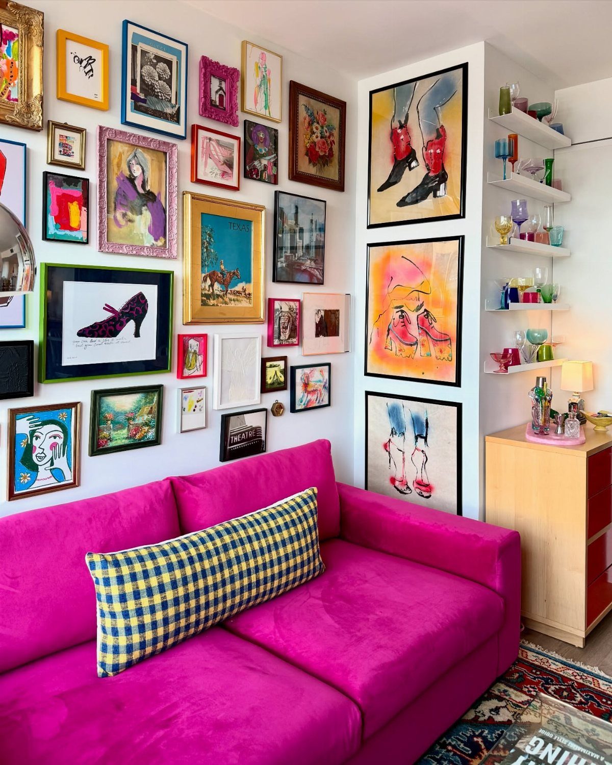
A gallery wall lets you layer color through art instead of committing to a painted surface. You can swap pieces out when your taste shifts, and the variety keeps the room from feeling locked into one palette.
The frames here bring their own color, letting each piece contribute to the whole.
That’s the safer route if you’re starting out. Once the wall feels full, you can mix in colored frames for even more punch.
Arrange the pieces on the floor before you hang anything. Hang the center piece at eye level, then work outward.
4. Layered Textiles
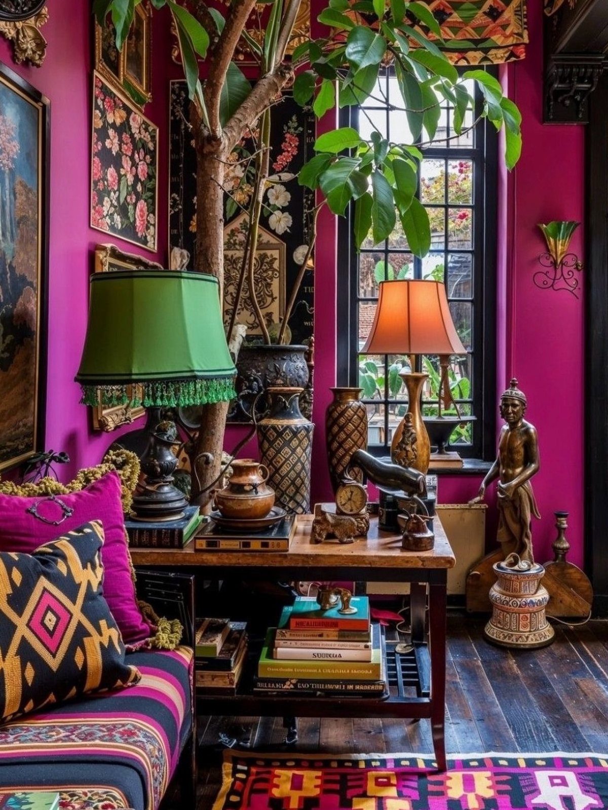
Textiles stack color and pattern without permanent change. A throw, a pillow, a rug, and a curtain can each pull from a different part of the spectrum, and the room feels collected rather than matchy.
The magenta wall amplifies the effect, but layered textiles work just as well in a neutral room if you want the option to dial color up or down later.
I look for fabrics with at least one overlapping hue so the layers feel connected.
Swapping textiles by season is cheap and fast, which makes this the lowest-commitment option on the list.
5. Bold Rug
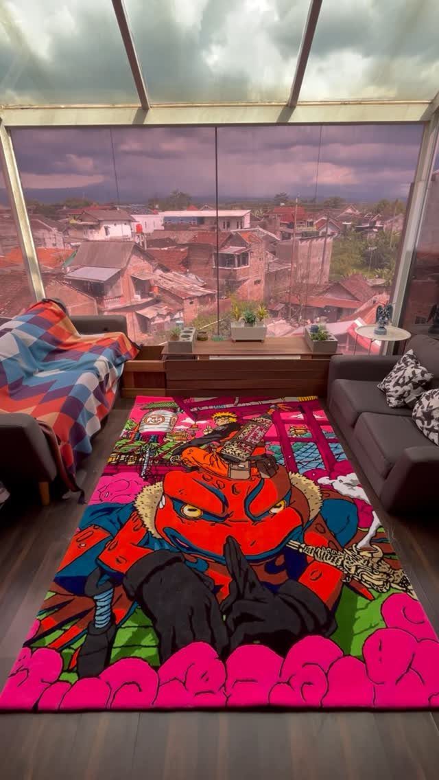
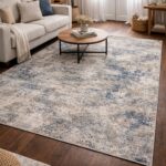
A bold rug anchors the room and gives every other color something to play off. It works especially well in a space with neutral walls and furniture, where the floor becomes the focal point by default.
The scale matters here.
A small rug fragments the space; a large one that reaches under the sofa pulls the seating area together. I’d go at least 8×10 in a living room, larger if the room allows it.
Patterned rugs hide wear better than solid ones, which matters if the room gets heavy use.
6. Tropical Room Colors
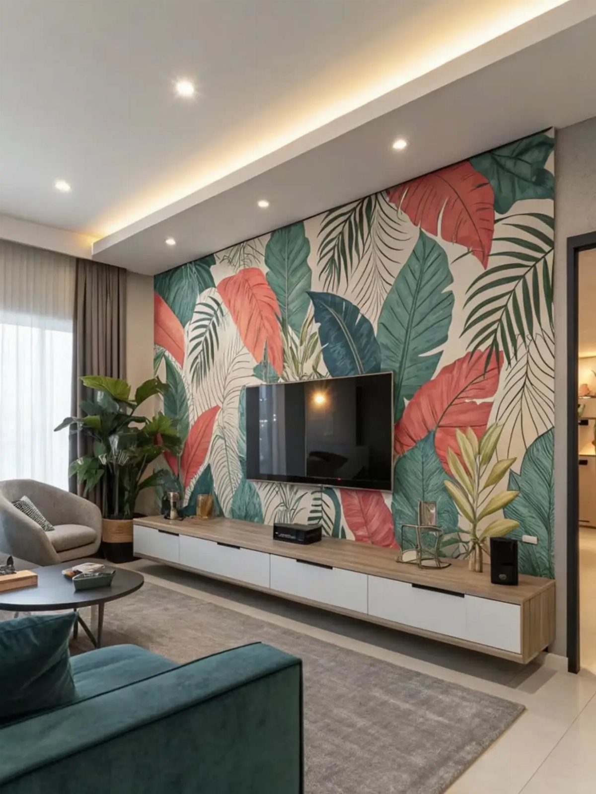
Tropical colors, greens, teals, and coral, bring energy without reading as loud as primary brights. The leaf mural sets the palette, and the teal sofa picks up one of the tones to pull the room together.
A few tropical prints or a single accent wall will get you there.
A teal or coral accent wall with green plants does the same work. If you’re renting, peel-and-stick tropical wallpaper goes up in an afternoon and comes down clean.
Pair tropical tones with natural wood and white to keep the look fresh instead of dated.
A setting that instantly uplifts, the room couldn’t be more fitting for starting your day. It proves that color needn’t be limited to purely decor or paint; in fact, vibrant wallpaper is sometimes all a room needs to feel enlivened – the rest can follow suit.
7. Coastal Pop Chic
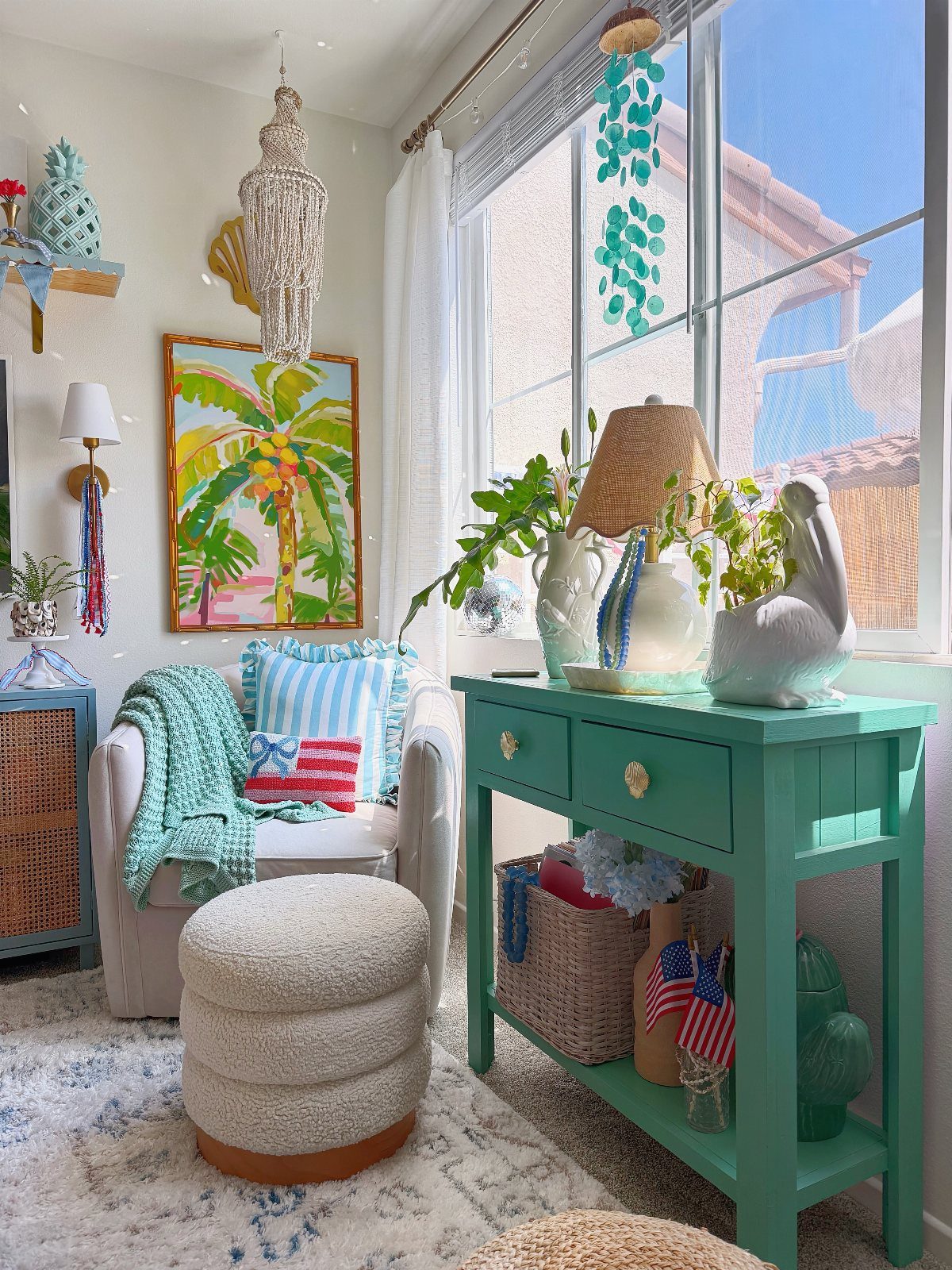
Coastal stops reading bland when you spike the usual blues and whites with citrus yellow and hot pink. The teal side table and bright art keep the room from leaning too beachy, which happens when every surface goes pale.
Layering shades of blue, pillows, throws, artwork, gives the room depth without adding more colors to track. I’d add one warm accent, coral or orange, to stop the cool tones from feeling flat.
This works in a rental because the color lives in what you bring, not what you paint.
8. Petite Punch
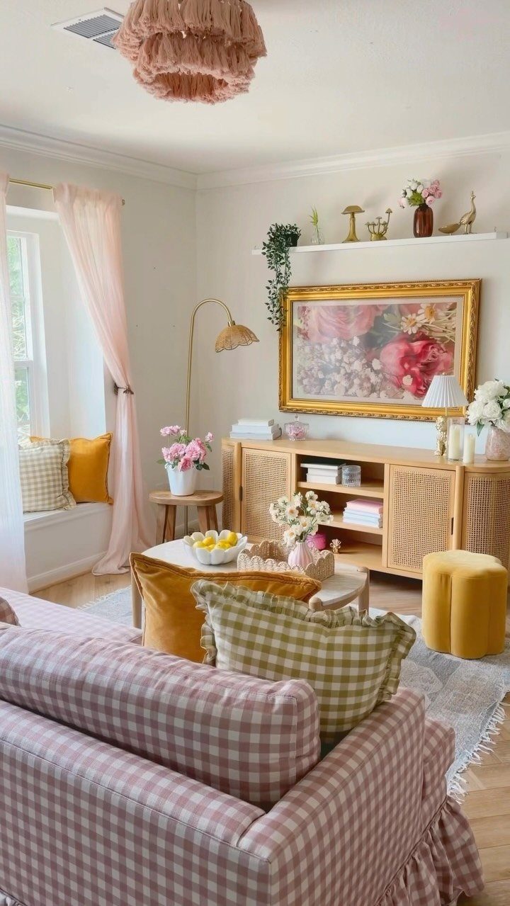
A small space gets more personality from one strong furniture piece than from scattering tiny accents.
The pink gingham sofa claims the corner, and the yellow side table and lamp repeat the second color so the room doesn’t hinge on pink alone.
The fringe pendant adds texture overhead, which matters in a tight space where you can’t spread things out horizontally. Mixing round and angular shapes keeps a small arrangement from feeling too uniform.
One bold piece costs less to commit to than repainting the whole room.
9. Accent Chair
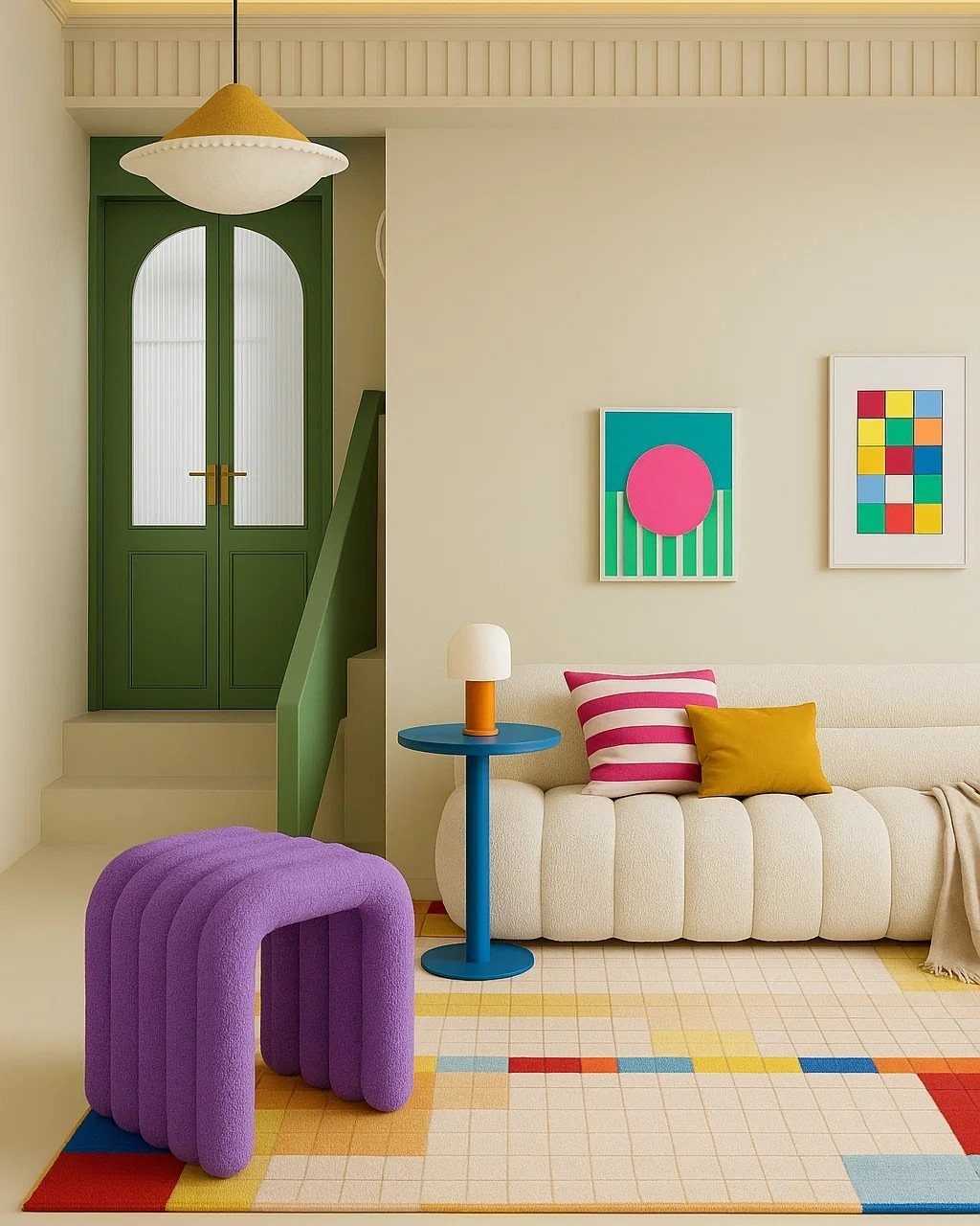
An accent chair in a sculptural shape or saturated color pulls focus without repainting or rearranging the rest of the room. The purple textured chair here does both, which keeps it interesting even after the initial surprise wears off.
Place it where natural light hits it, near a window or under a pendant, so the color reads true and the texture shows.
In a neutral room, one accent chair is enough. In a room with color already on the walls, match the chair to a shade that’s already present or choose a complement.
10. Colorful Living Room
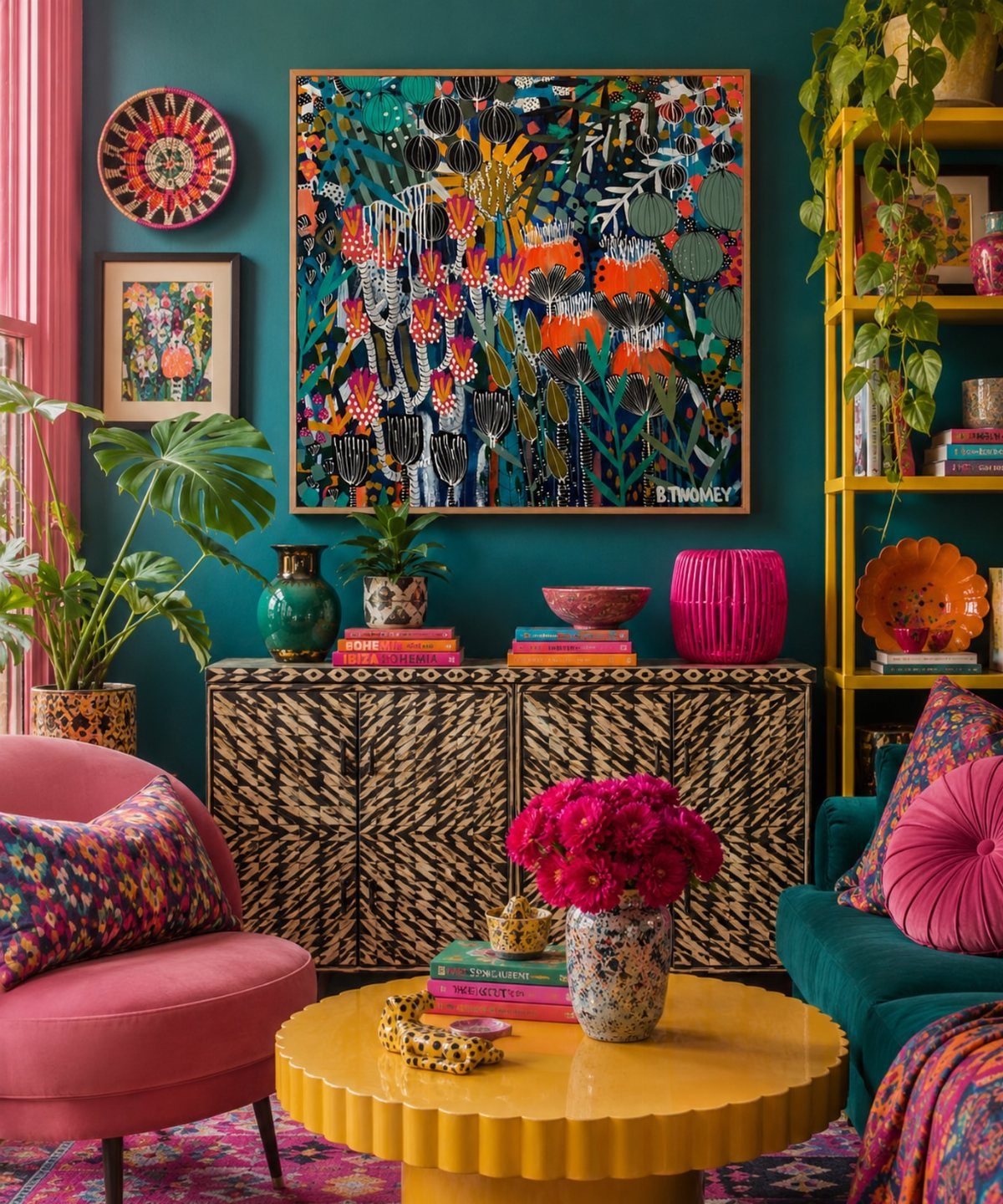
Layering multiple bold colors works when each one shows up more than once. The teal repeats in the wall and the sofa, the pink in the chair and the art, so the room feels intentional instead of random.
The patterned sideboard adds another layer without introducing a new color, which matters when you’re already working with several hues. I’d stop here; adding another color would tip it into busy.
Start with 2 main colors and add a third only after the first 2 feel balanced.
11. Color Drenched Shelving
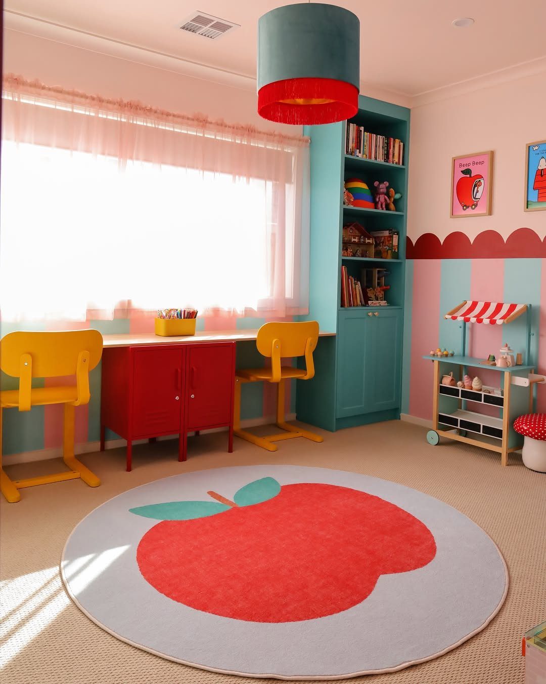
Painting built-in shelves a saturated color turns storage into a feature.
The teal shelving here frames the toys and books, and the contrast makes the items on the shelves easier to pick out, which matters in a kid’s room where finding things quickly cuts down on mess.
Pair the shelving color with one or 2 accent colors in the furniture or rug so the room doesn’t feel like it’s built around a single moment. In a playroom, washable paint is worth the extra few dollars per gallon.
12. Watercolor Accent Wall
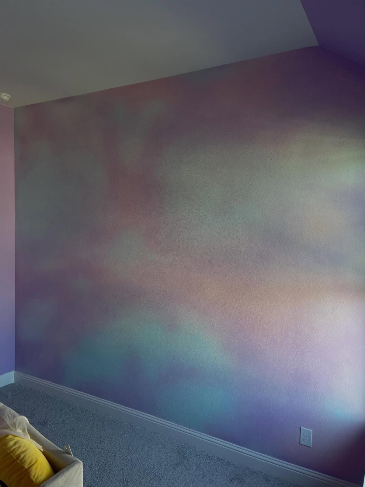
A watercolor wall softens color in a way that a solid painted wall doesn’t. The blended edges keep the room from feeling boxed in, and multiple colors fade into each other instead of reading as stripes.
Use a damp sponge or rag to blend the edges while the paint is still wet, working in small sections so you can control the gradient.
Start with the lightest color and add darker tones in layers, letting each one dry partway before adding the next.
This takes longer than rolling a single color, budget an afternoon for one wall.
13. Hand-Painted Wall Murals
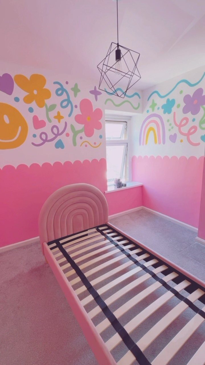
Hand-painted flowers, hearts, and rainbows turn a wall into a custom focal point that changes the whole room for the cost of paint and an afternoon.
The loose, irregular shapes keep it playful instead of precious, which matters in a bedroom where you’re looking at it every day.
Simple shapes like circles, arcs and blocks work fine even if you’ve never painted anything on a wall before. Use a pencil to sketch the outlines lightly first, then fill them in with craft paint and a cheap brush.
This works in a rental only if you’re willing to repaint white when you leave.
14. Colorful Beaded Window Curtain
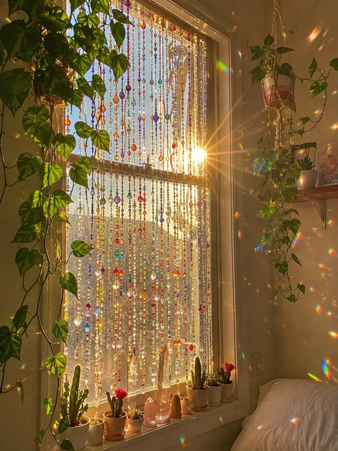
Beaded curtains filter light without blocking it completely, so the window stays functional and you get color in motion every time air moves through the room.
The beads catch sunlight and throw small colored reflections onto nearby surfaces, which adds another layer without doing anything permanent.
Hang the curtain from a tension rod if you’re renting.
Acrylic beads weigh less than glass and cost less to replace if a strand breaks. Measure the window width and buy a curtain that’s slightly wider so the strands hang close enough to overlap when still.
The beads click when they move, which some people find grating after a few days.
15. Rainbow Light Projection
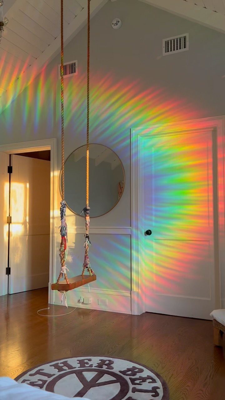
A rainbow prism projection puts color on the wall without touching it. The light shifts as the sun moves, so the room changes through the day instead of staying static.
You need a window that gets direct sun for part of the day, or the prism won’t throw much color.
Position the prism where afternoon sun comes through at an angle, and you’ll get color scattered across the floor and walls. Adjust the height until the rainbow lands where you want it.
The effect lasts an hour or two depending on the season and which direction the window faces.
16. Vibrant Hanging Acrylic Chain
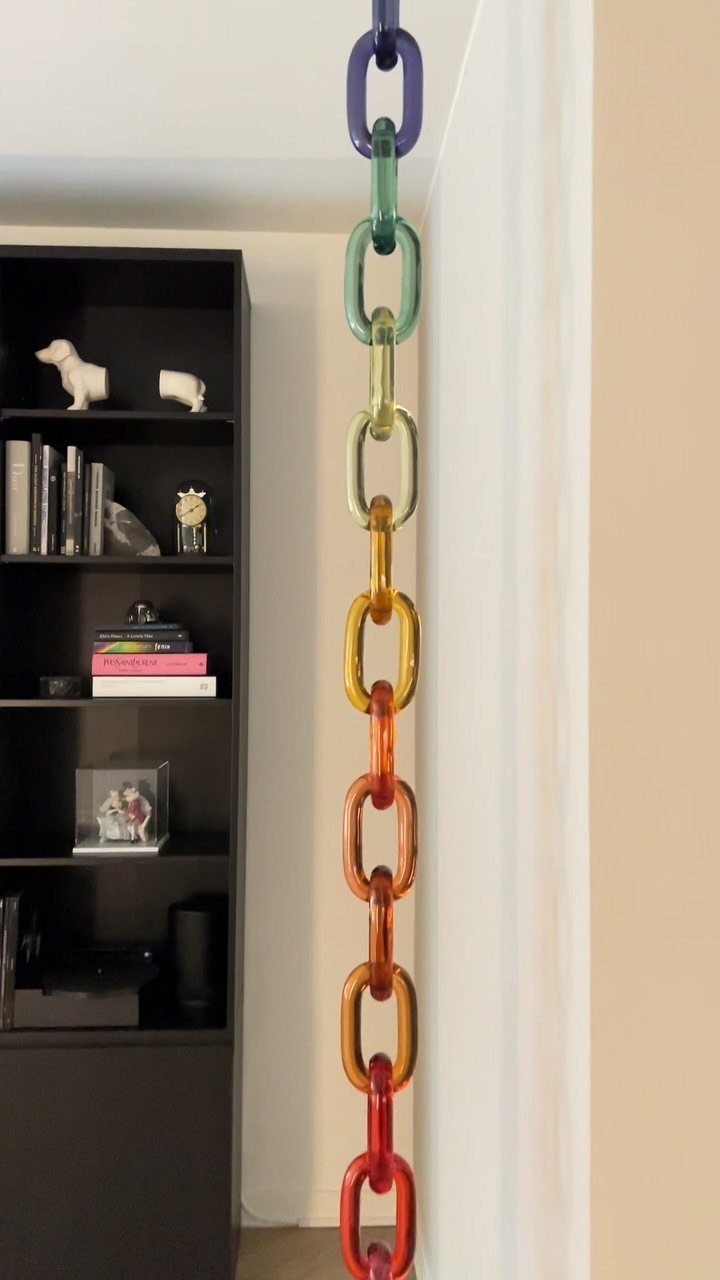
A hanging acrylic chain adds color vertically, which pulls the eye up and makes the ceiling feel higher. The translucent links catch light without blocking it, so the chain reads as decoration rather than barrier.
You can make one by threading acrylic chain links, sold individually at craft stores, onto fishing line or lightweight cord.
Knot the cord at intervals to keep the links spaced evenly. Hang it from a ceiling hook, placing it near a window or lamp so light passes through.
Using Color Intentionally
Balance matters more than the number of colors you use. A room with 5 hues can feel calm if each one repeats several times, while a room with 2 colors can feel scattered if they only appear once.
I look for spaces where color shows up in layers: a wall, a piece of furniture, and a textile that all pull from the same family.
Restraint works as its own design choice.
A single bold piece in a neutral room lands harder than spreading weak color across every surface. The contrast gives the eye somewhere to rest, which makes the color feel intentional instead of accidental.
Personal reaction to color can override what color psychology suggests. Blue is supposed to feel relaxing, but if a certain shade reminds you of something unpleasant, it won’t deliver calm no matter what the theory says.
Pick colors that feel right to you first, then adjust the intensity to match the mood you want.
Color Psychology
Green reads as restful because it mirrors nature, which makes it a good choice for bedrooms and spaces where you want to wind down.
Red amps up energy and can make a room feel more alert, which works in a dining room or entryway but can feel too intense in a bedroom if you’re trying to sleep.
Yellow supports focus and creativity, so it fits home offices and kitchens where you’re actively working through tasks. Blue brings relaxation and peace, which makes it popular in bathrooms and bedrooms.
Your own history with a color can flip the expected response. If a shade ties to a specific memory or place, that association will overpower the general psychology.
Test a color on a small surface before committing to a full wall, and live with it for a few days to see if the feeling holds.
Mixing Patterns
Patterns add depth when they share a color palette but vary in scale and style.
Florals, stripes, and geometric prints can sit in the same room as long as a few colors run through all of them, which ties the look together instead of splitting it into unrelated moments.
Mixing patterns through textiles costs less than changing furniture and gives you room to adjust as your taste shifts.
Pillows, rugs, and bedding let you layer prints without permanent commitment. I start with one large patterned piece, usually a rug or duvet, then bring in smaller prints that pull one or 2 colors from the anchor.
Layering rugs with contrasting patterns but similar tones creates visual interest without feeling chaotic. Overlap them or place them side by side, keeping one uniting element like texture or a shared color family so the combination feels deliberate.
Frequently Asked Questions
How to create a beautiful room?
Focus on balanced color repetition rather than quantity: a few hues that each appear several times across walls, furniture, and textiles feel more intentional than many colors scattered without connection.
A single strong color against calm surroundings pulls focus better than scattering weak doses of it across every surface.
Choose colors you actually like, then dial the saturation up or down to fit the room’s purpose, because what a color means to you matters more than what a chart says.
What are some creative color combinations for my bedroom?
Shades like jade, turquoise, and peachy coral read tropical but stay surprisingly easy to live with when you balance them with pale wood and crisp white.
Coastal blues and whites stop feeling bland when spiked with citrus yellow or hot pink through pillows, throws, and artwork.
Jewel tones work well when each color shows up more than once, like teal in both the wall and sofa, so the room feels intentional rather than random.
How to pick a color theme for your room?
Find a patterned rug or bedspread you love, then repeat 1 or 2 of its colors in pillows or art so the palette feels intentional instead of random.
One bold anchor piece, whether that’s a jewel-toned sofa or a richly dyed rug, gives smaller accents a reference point and keeps neutral walls from feeling flat.